Basic Statistics
The Statistics tab displays statistical information for the selected columns.
See also the "View Basic Statistics" section in Getting Started.
Statistics by Data Type
The statistics displayed vary depending on the column's data type.
Numeric Type (int64, float64)
When you select a numeric column, the following statistics are displayed.
Measurement Scales and Displayed Statistics
For numeric types, MIDAS displays only statistically meaningful items based on the column's measurement scale (Nominal, Ordinal, Interval, Ratio).
| Statistic | Nominal | Ordinal | Interval | Ratio |
|---|---|---|---|---|
| mode | o | o | o | o |
| Category breakdown | o | o | ||
| min / max | o | o | o | |
| Quantiles (median, iqr, etc.) | o | o | o | |
| mean / std | o | o | ||
| skewness / ex. kurt | o | o | ||
| range | o | o |
For example, postal codes should be treated as Nominal scale. When treated as nominal, mean and standard deviation are not displayed because numerical magnitude has no meaning for nominal scales.
See Data Preparation and Import for how to change measurement scales.
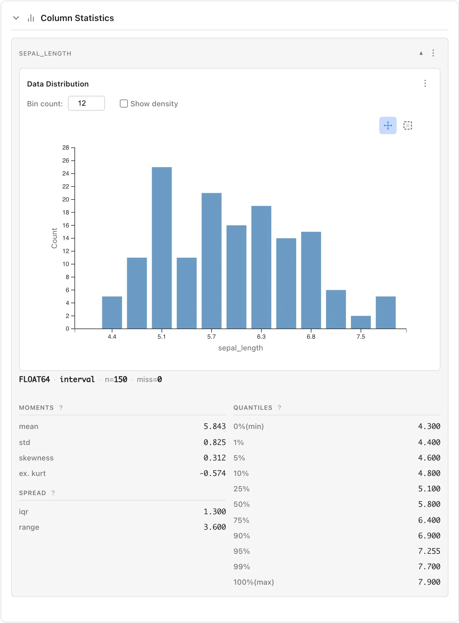
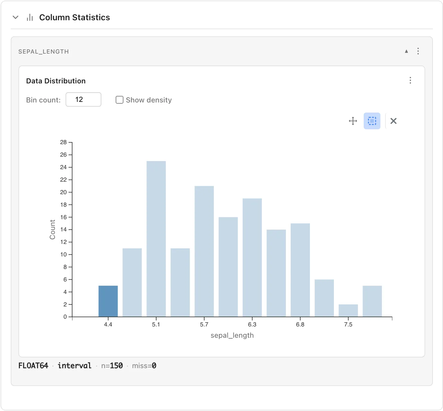
Basic Information
The column header shows data type, measurement scale, valid count (n), and missing count (miss).
Example: FLOAT64 · interval · n=150 · miss=0
Data Distribution (Histogram)
Visualize the distribution of your data.
- Bin count: Adjust the number of histogram bins
- Show density: When checked, displays density instead of frequency
Use the buttons at the top right of the chart to switch operation modes:
- Pan mode: Drag to pan the chart
- Select mode: Drag to select a range and highlight corresponding rows
Moments
- mean: Average value
- std: Standard deviation (population standard deviation)
- skewness: Skewness . 0 indicates symmetry; positive values indicate right-skewed
- ex. kurt: Excess kurtosis . 0 indicates same as normal distribution; positive values indicate heavier tails
Spread
- iqr: Interquartile range (75th percentile - 25th percentile)
- range: Range (maximum - minimum)
Quantiles
Shows positions when data is sorted in ascending order:
- 0%(min): Minimum value
- 1%, 5%, 10%: Lower percentiles
- 25%: First quartile
- 50%: Median
- 75%: Third quartile
- 90%, 95%, 99%: Upper percentiles
- 100%(max): Maximum value
String Type
When selecting a string column, the following are displayed:
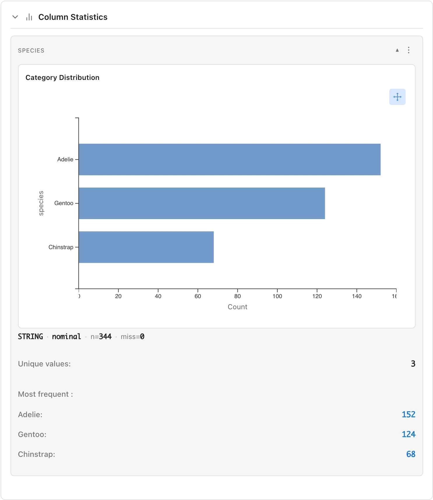
- Category Distribution: Bar chart showing count for each category
- Unique values: Number of unique values
- Most frequent: Most frequent values and their counts (click to select corresponding rows)
Boolean Type
When selecting a True/False column, the following are displayed:
- True: Count and percentage of True values
- False: Count and percentage of False values
Datetime Type
When selecting a datetime column, the following are displayed:
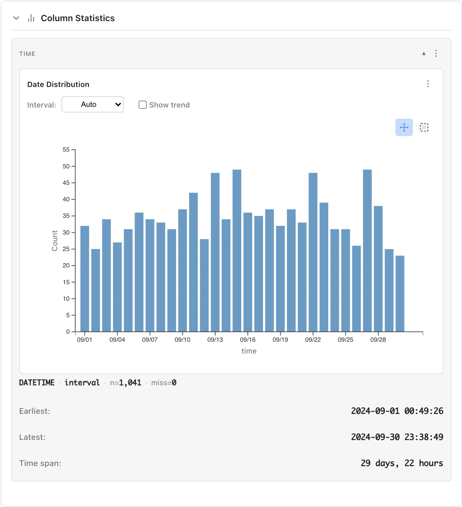
- Date Distribution: Chart showing data distribution over time
- Interval: Select aggregation interval (Auto, 1 minute, 1 hour, 1 day, 1 week, 1 month, etc.)
- Show trend: Display trend line
- Earliest: The oldest datetime
- Latest: The most recent datetime
- Time span: Duration (e.g., "29 days, 22 hours")
Comparing Multiple Columns (Relationships)
When you select two or more numeric columns, the Relationships section appears. The display varies depending on the number of selected columns.
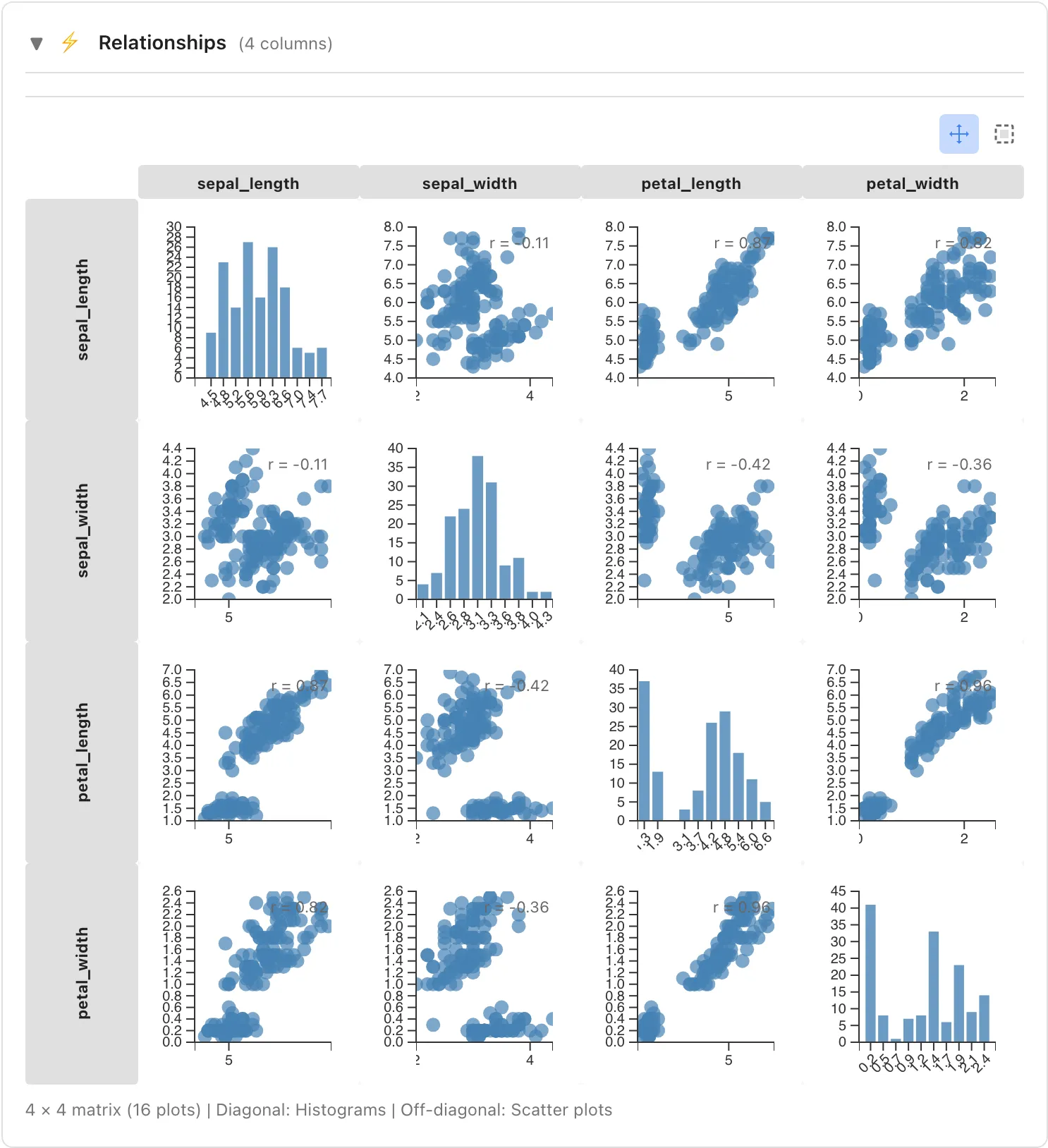
Scatter Plot Matrix (2-4 columns)
Displays combinations of selected columns in a scatter plot matrix:
- Diagonal: Histogram for each column
- Off-diagonal: Scatter plots for column pairs
Correlation Matrix (5+ columns)
When 5 or more columns are selected, a Pearson correlation coefficient heatmap is displayed instead of the scatter plot matrix. Color intensity indicates correlation strength.
Comparison Table
Compare statistics of selected columns side by side. Displays mean, std, skewness, ex. kurt, quantiles (min through max), iqr, and range for each column. Columns with ratio scale also show the coefficient of variation (cv) and geometric mean (geo mean).
Grouping Feature
Select a column from the Show stats by dropdown to group data by that column's values and view statistics for each group.
How to Use
- Select a column to use for grouping from the Show stats by dropdown in the Statistics tab (e.g.,
species) - Statistics are displayed for each value in the selected column
Usage Example
When selecting the sepal_length column in the Iris dataset and grouping by species:
- Statistics for sepal_length of Iris-setosa
- Statistics for sepal_length of Iris-versicolor
- Statistics for sepal_length of Iris-virginica
are displayed separately, enabling comparison between species.
Row Selection Integration
You can select data rows from charts in the Statistics tab.
Selection from Histogram
Use the buttons at the top right of the chart to switch operation modes:
- Pan mode: Drag to pan the chart (default)
- Select mode: Drag to select a range
Click a bar: Click a histogram bar to select rows within that bin (range).
Rectangle selection: In Select mode, drag to specify a range and select data within that area.
Selected rows can be viewed in the Selected Rows tab.
Adding to selection: Hold Ctrl (Mac: Cmd) while clicking to add to existing selection.
Selection from Scatter Plot
The scatter plot matrix displayed when multiple numeric columns are selected also supports clicking and rectangle selection for row selection.
Opening Filtered Data Tab
Double-click on a data point or bar in the chart to automatically open a Filtered Data tab displaying the selected data.