Advanced Graph Creation
Open a Graph Builder tab and select Custom Graph from the Graph Type list. Open Graph Builder from Analysis → Graph Builder....
Graph Builder provides multiple Graph Types such as Bar Chart, Histogram, and Scatter Plot. When you have a well-defined graph format in mind and only need minor adjustments, these are convenient and easy to use.
When you need to overlay a regression line on a scatter plot, compare subgroups with facets, or combine multiple graph types into one, use Custom Graph.
Custom Graph is based on the Grammar of Graphics framework. It decomposes graphs into components and combines them as layers.
- Overlaying multiple graph types in one graph (e.g., scatter plot + regression line)
- Visualizing data after statistical transformation (e.g., histogram, kernel density estimation)
- Exploring multidimensional data with facets (small multiples)
- Flexibly controlling axis scales and directions
If other Graph Types are like "ready-made furniture," Custom Graph is like an "assembly kit of materials." Once you understand the basic components, you can create diverse visualization patterns.
Components of Grammar of Graphics
Custom Graph builds graphs by combining the following elements.
- Data: The dataset to visualize
- Aesthetics: The mapping between variables (dataset columns) and visual attributes (position, color, size, etc.)
- Geometry: The visual representation of data (Point, Line, Bar, etc.)
- Statistics: Statistical transformations of data (binning, smoothing, etc.)
- Scales: How to convert data values to visual values
- Coordinates: Coordinate system (Cartesian coordinates, axis swapping, etc.)
- Position: Position adjustment of elements (stacking, dodging, etc.)
- Facets: The structure when creating graphs composed of multiple small graphs
These elements are bundled into Layers, and overlaying multiple layers creates diverse visualizations.
Data - Selecting Data
First, select the dataset to visualize. Here we use the Auto MPG dataset (fuel efficiency data for 398 cars from 1970-1982).
Aesthetics - Mapping Visual Attributes
Map data columns to visual attributes. The most basic is mapping two continuous variables to the x and y axes.
Data: Auto MPG
Aesthetics: x = weight, y = mpg
Geometry: Point
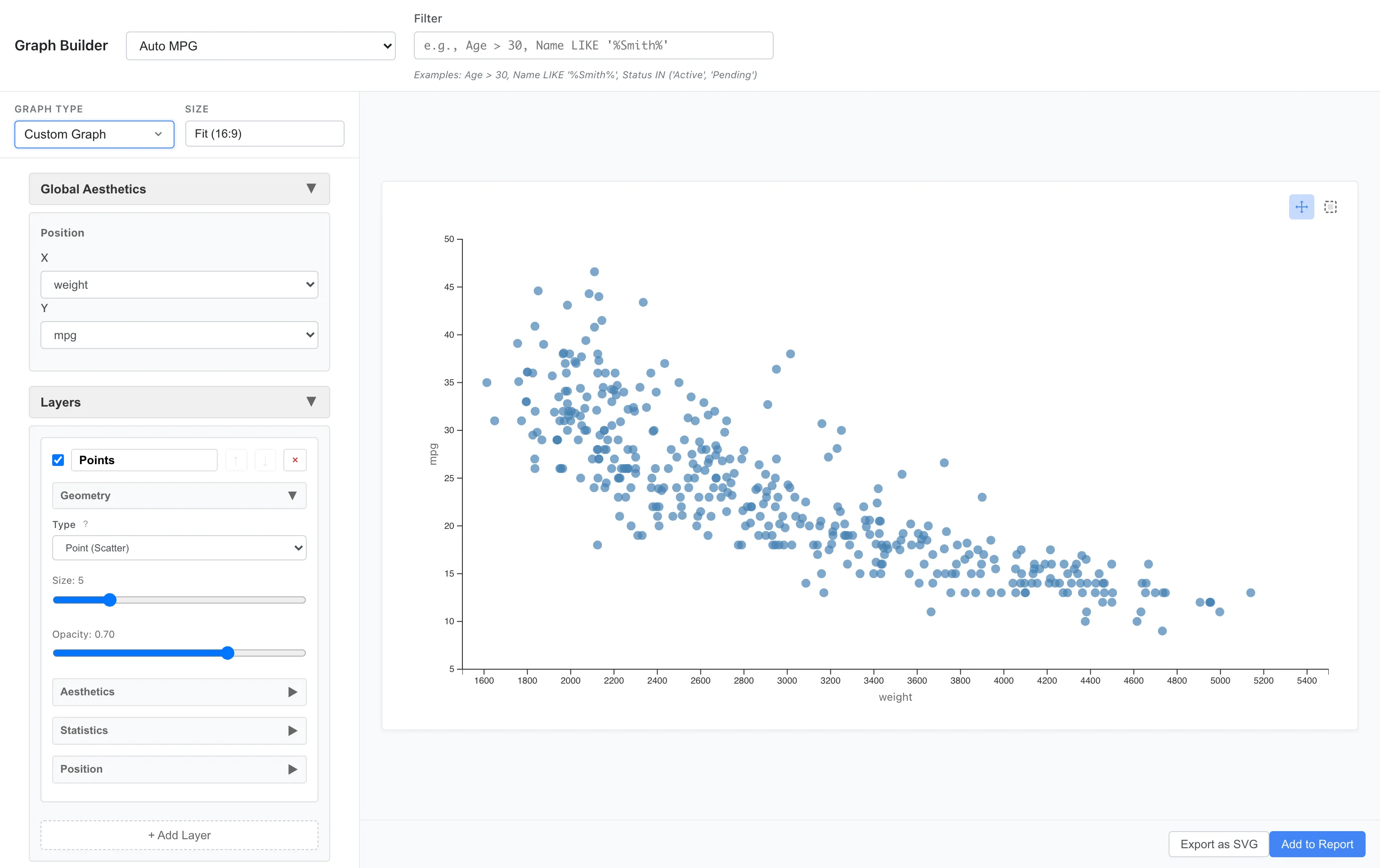
A negative association is visible: heavier cars have worse fuel efficiency.
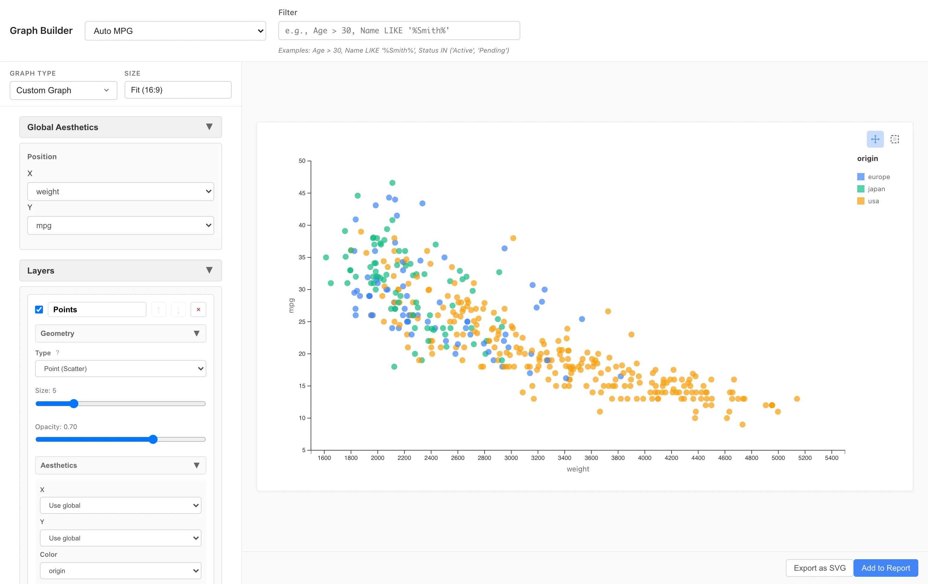
Mapping to Color
You can add more information by mapping a third variable to color.
For example, let's color-code by origin (usa, europe, japan).
Aesthetics: x = weight, y = mpg, color = origin
Mapping to Size
Map horsepower to point size.
Aesthetics: x = weight, y = mpg, color = origin, size = horsepower
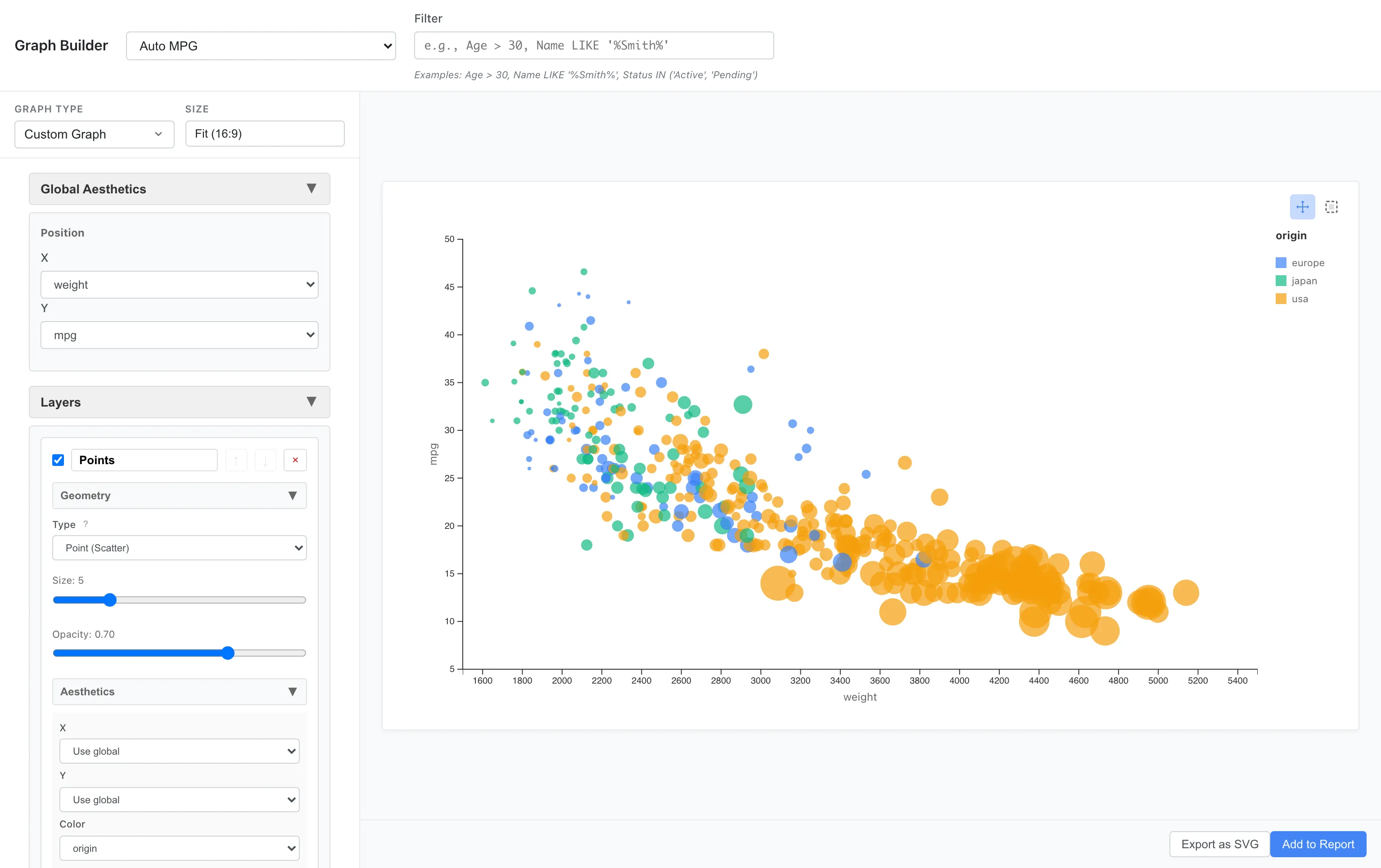
Larger points indicate higher horsepower. You can visually understand the relationship: heavy, high-horsepower cars have poor fuel efficiency.
fill and color
Aesthetics has two color specifications: fill and color. fill applies to the interior of geometries such as Bar and Area. color applies to outlines, strokes, and points such as Point markers, Line strokes, and Bar borders. Point and Line do not support fill; their color is controlled entirely through color.
Layers - Overlaying Layers
Layers allow you to overlay multiple graphs. For example, let's add a LOESS (locally weighted regression) smoothing curve on top of a scatter plot.
Layer 1: Point (x = weight, y = mpg)
Layer 2: Line + Smooth statistic (method = loess)
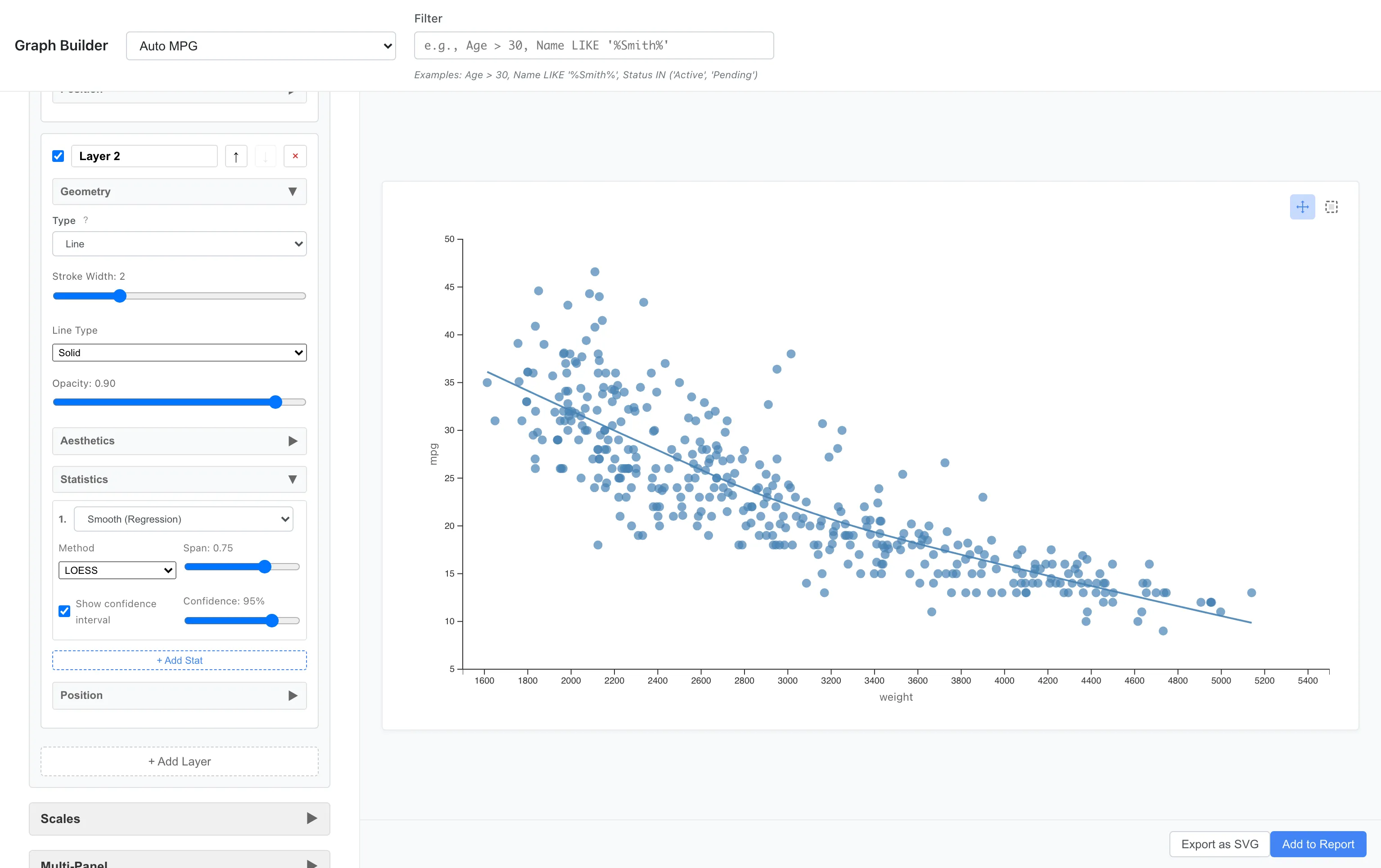
The blue line is the LOESS smoothing curve. It summarizes the local pattern of the data as a smooth curve. Change Method to Linear (LM) to draw a linear regression line instead.
When LOESS is selected, Span sets the fraction of data points used as neighbors at each location, in the range 0.1-1.0. Larger values use a wider neighborhood and produce a smoother curve; smaller values follow local variation more closely. The default is 0.75.
LOESS computes each fitted value by local linear regression weighted with a tricube kernel. Near the ends of the data range the neighborhood is one-sided, but the weight formula is the same as in the interior (no special edge correction). Linear (LM) is an OLS simple regression with x as the sole covariate. When points are grouped by color, fill, stroke, shape, or linetype aesthetics, the smooth stat fits a separate regression for each group. Weighted regression and robust standard errors are not supported.
Turning on Compute interval band outputs the lower and upper bounds as ymin and ymax. Interval type selects between two interval kinds; the default is the prediction interval (PI).
- Prediction (individual observation): the range that a newly observed single value at x will fall into with the nominal probability. LM uses . The
1inside the square root is the relative coefficient of the new observation's error variance . - Confidence (mean response): a frequentist interval that, under repeated sampling, covers the true mean response at the nominal level. It reflects the precision of the fitted line itself. LM uses .
At the same level the PI is always wider than the CI. Interval level sets the nominal level and defaults to 95%. Linear (LM) evaluates the classical -distribution interval at 101 equally spaced points between the minimum and maximum of x. LOESS evaluates an approximate interval from the weighted predictor variance of the local regression at the original data x positions.
The interval relies on the following assumptions. It assumes independent, homoskedastic errors, so it underestimates width on data with time-series or clustered structure. The PI additionally requires approximate normality of the new observation's error; the CI is robust to moderate non-normality at large samples via the CLT, but the PI is not. Robust standard errors (HC) and weighted regression are not supported. For LOESS, larger span values introduce more smoothing bias, but the interval width does not reflect this bias; at extreme spans the nominal level may diverge from the actual coverage. The LOESS PI uses the simple approximation . The interval is not emitted when data points are too few, when (constant x), when the residual variance is zero, or when for LOESS. When data is grouped by aesthetics, these conditions are evaluated per group: some groups may show the interval band while others do not.
Line geom automatically draws the interval as a shaded band when ymin/ymax are present. You can also use a separate Ribbon layer for more control over the band appearance. To overlay both the CI and the PI, add two smooth layers with different interval types.
Statistics - Statistical Transformations
You can display data not just as-is, but after statistical transformation.
Histogram (Binning)
To see the distribution of fuel efficiency, we divide the data into bins (intervals) and count them.
Aesthetics: x = mpg
Geometry: Bar
Statistics: Bin (bins = 20)
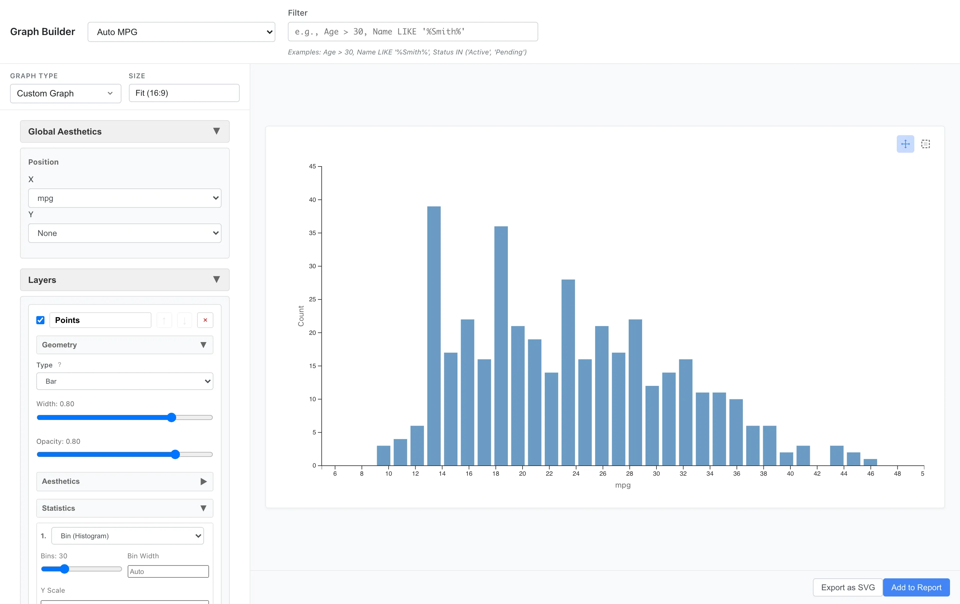
You can see that most cars are concentrated in the 15-30 mpg range. The distribution is right-skewed, with fuel-efficient cars being a minority.
The default value of bins is 30. Adjust it manually based on the shape of the distribution.
Density Estimation
Instead of bins, you can express the distribution as a smooth density curve.
Aesthetics: x = mpg
Geometry: Line
Statistics: Density
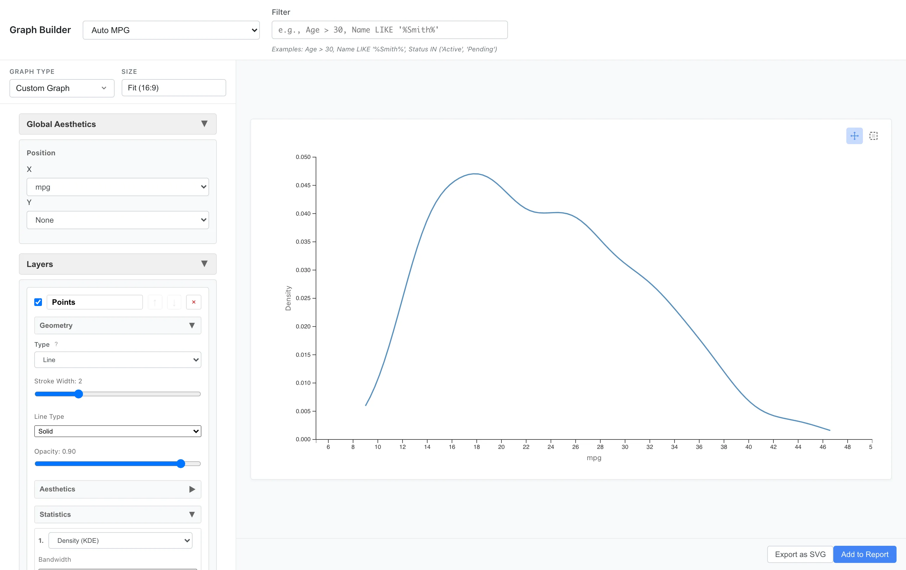
This expresses the same data distribution in a different way. The density is estimated with a Gaussian kernel, and the bandwidth is chosen automatically by Silverman's rule of thumb.
Comparing Densities Across Multiple Groups
By overlaying density curves for each category, you can compare distribution differences.
Let's draw density curves on top of histograms for each origin.
Layer 1 (Bar):
  Aesthetics: x = mpg, fill = origin
  Geometry: Bar
  Statistics: Bin (bins = 30)

Layer 2 (Line):
  Aesthetics: x = mpg, color = origin
  Geometry: Line
  Statistics: Density (Y Scale = Count)
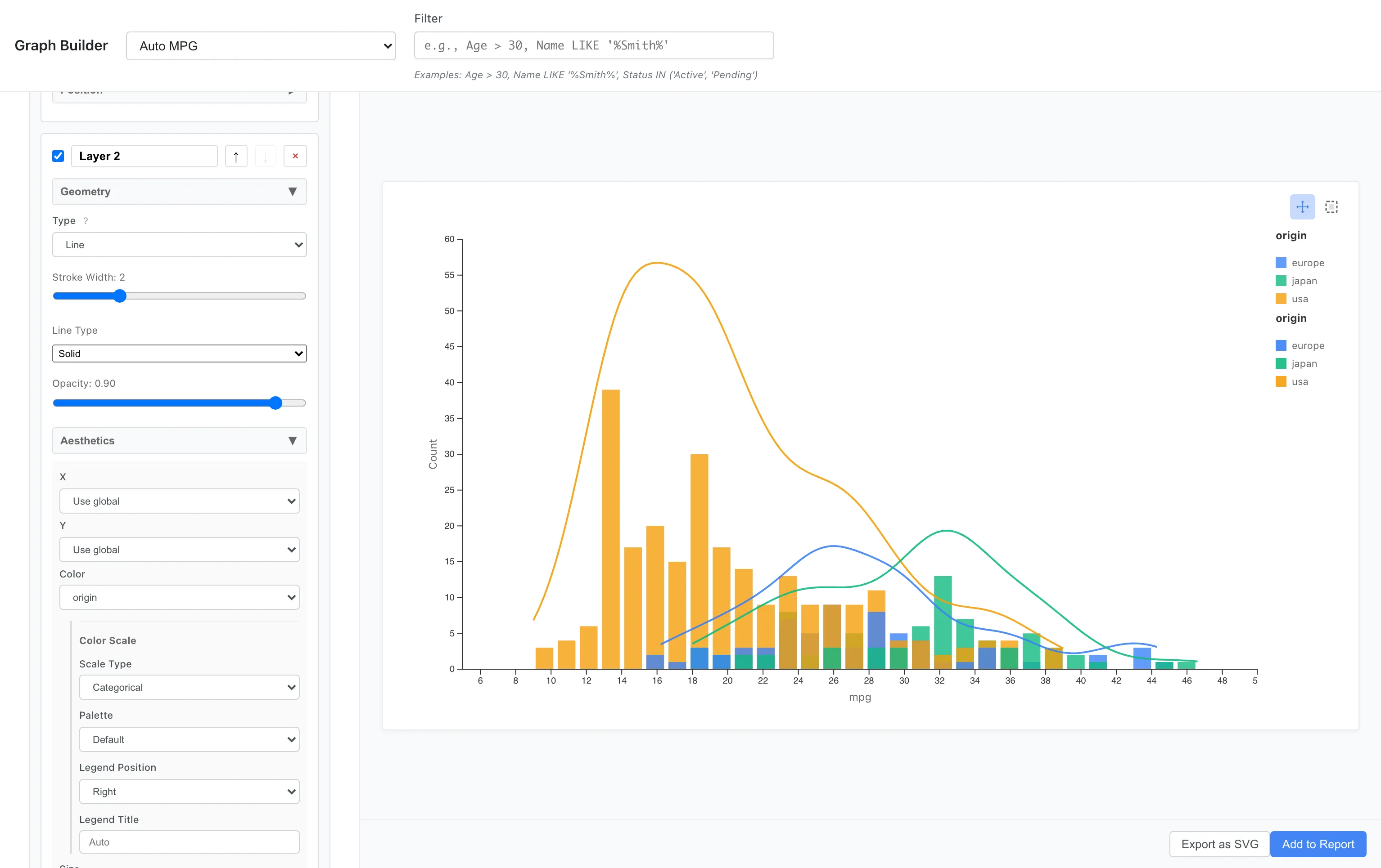
Key points:
- Layer 1 (Bar):
fill = originfor color-coded bar fill - Layer 2 (Line):
color = originfor color-coded density curve lines.Y Scale = Countmultiplies the density by the sample size and bin width to produce a count-scaled curve. The bin width is computed internally with Sturges' formula, independent of thebins = 30in Layer 1, so the two y-axes are not guaranteed to match exactly - Bar fill uses
fill, Line stroke usescolor. Since the same color scale is applied, colors match
It's clear that Japanese cars peak on the high fuel efficiency side, while US cars peak on the low fuel efficiency side.
Position - Position Adjustment
Position adjustment becomes important when comparing multiple categories in bar charts.
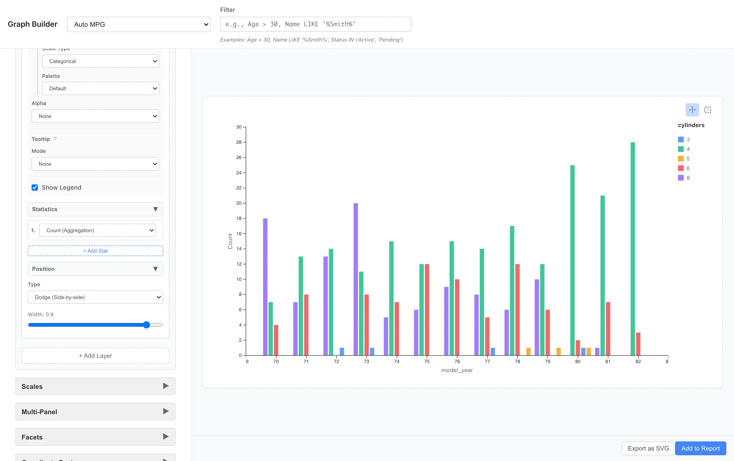
Stacked Bar Chart
Aesthetics: x = model_year, fill = cylinders
Geometry: Bar
Statistics: Count
Position: Stack
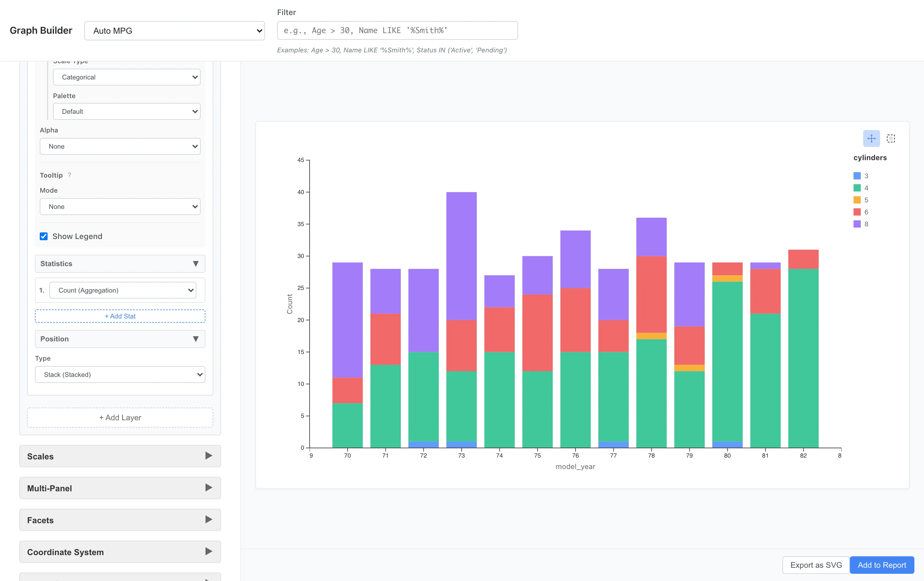
The breakdown of car types for each year is shown as stacked bars. 8-cylinder cars were common in the early 1970s, with 4-cylinder cars increasing toward the end.
Grouped Bar Chart
Changing Position to dodge displays them side by side.
Position: Dodge
This makes it easier to compare trends for each cylinder count. Use Stack to see overall composition, and Dodge to directly compare values between groups.
Stack as 100% Proportions
Setting Position to Fill normalizes each stacked bar so the total equals 100%. Useful when you want to compare category proportions over time or across groups.
Position: Fill
Reduce Point Overlap
Setting Position to Jitter adds small random displacement to each point so overlapping points become distinguishable. When x is numeric, points are displaced in both the X and Y directions; when x is categorical, only in the Y direction. It helps reveal density in Point scatter plots where many observations share the same x value. Unlike Dodge, which shifts along category boundaries, Jitter uses random displacement, so individual point positions vary slightly each time the plot is redrawn.
Coordinates - Coordinate System
Flipping Axes
Flipping histograms and bar charts horizontally makes long labels easier to read.
Aesthetics: x = mpg
Geometry: Bar
Statistics: Bin
Coordinates: Flipped
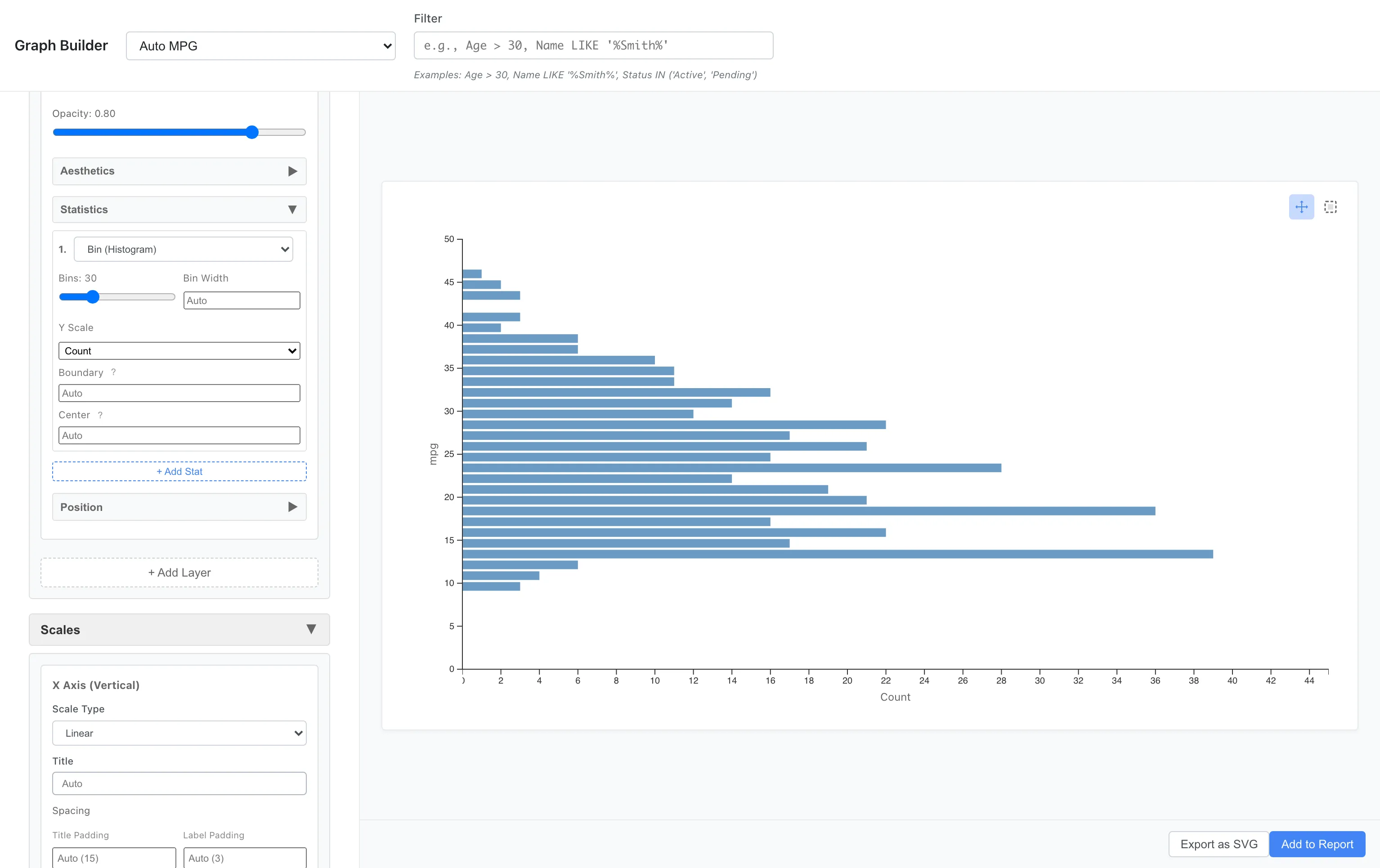
The vertical and horizontal axes are swapped, displaying the histogram horizontally. Useful when category names are long or when you want to effectively use vertical space.
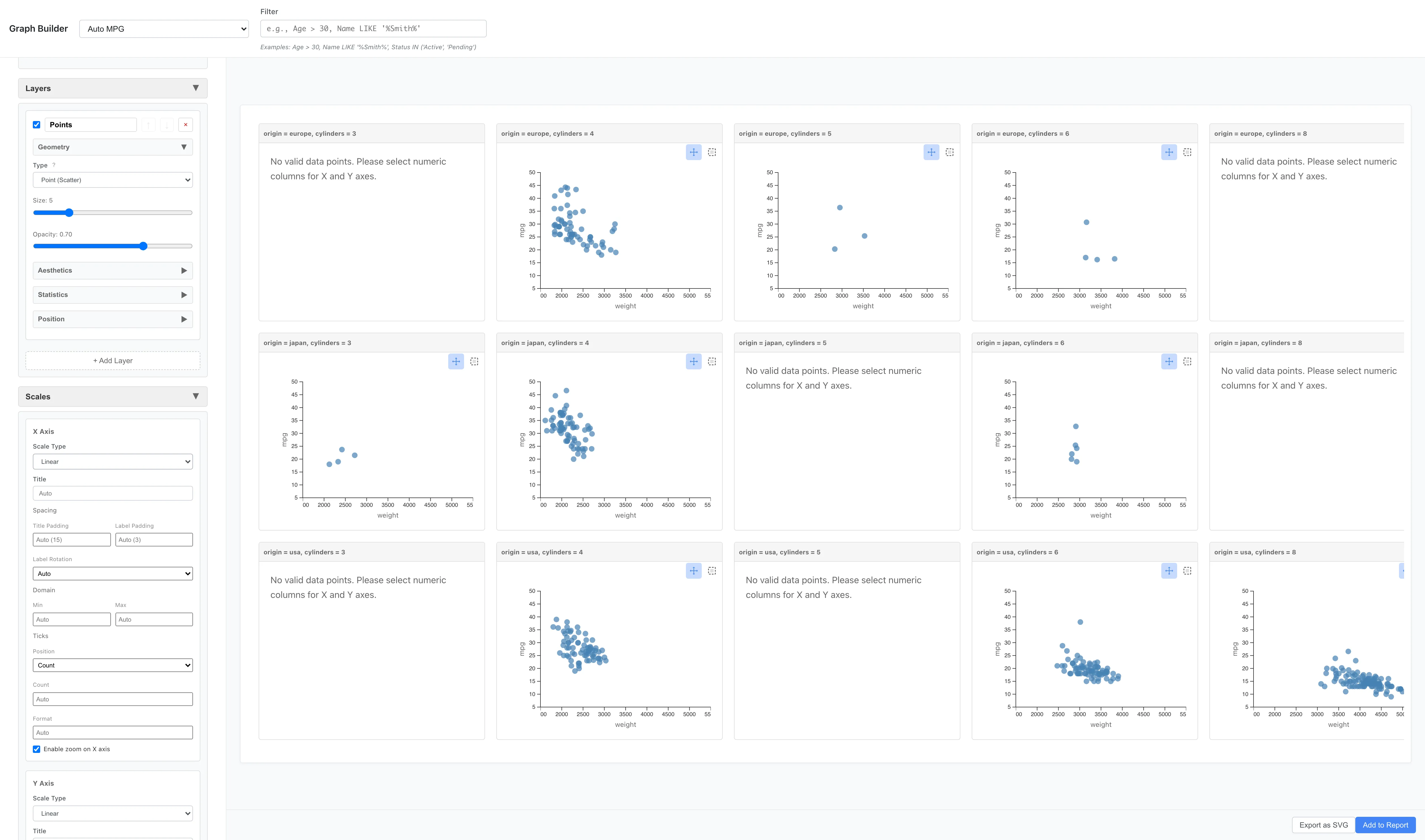
Facets - Facet Division
Splitting and arranging graphs by category makes subgroup comparison easier. The Facets section has two types: Facet Wrap (division by single variable) and Facet Grid (matrix division by two variables).
Facet Wrap - Division by Single Variable
Facet Wrap divides data by one variable and arranges multiple panels in a grid. Any column in the dataset can be used for division. Columns whose number of unique values exceeds the limit cannot be selected. The limits default to 20 categories per variable and 50 panels in total, and both can be changed in Settings.
Aesthetics: x = weight, y = mpg
Geometry: Point
Facets: Type = Facet Wrap (Single Variable)
  Variable = cylinders
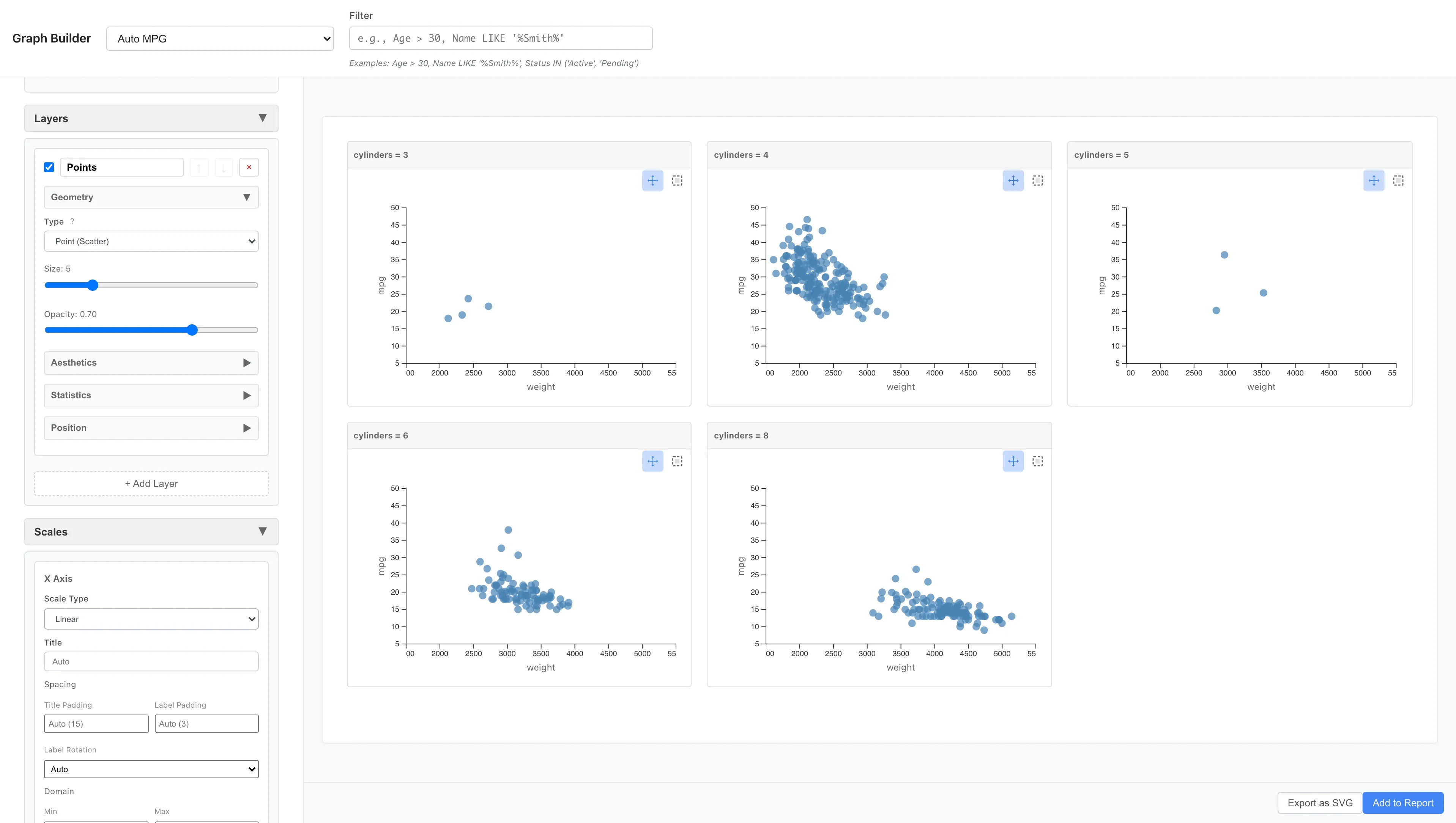
You can compare the weight-fuel efficiency relationship side by side for 4-cylinder, 6-cylinder, and 8-cylinder cars. 8-cylinder cars are generally heavier and concentrated in the poor fuel efficiency range.
As another example, you can also divide by origin:
Aesthetics: x = weight, y = mpg
Geometry: Point
Facets: Type = Facet Wrap (Single Variable)
  Variable = origin
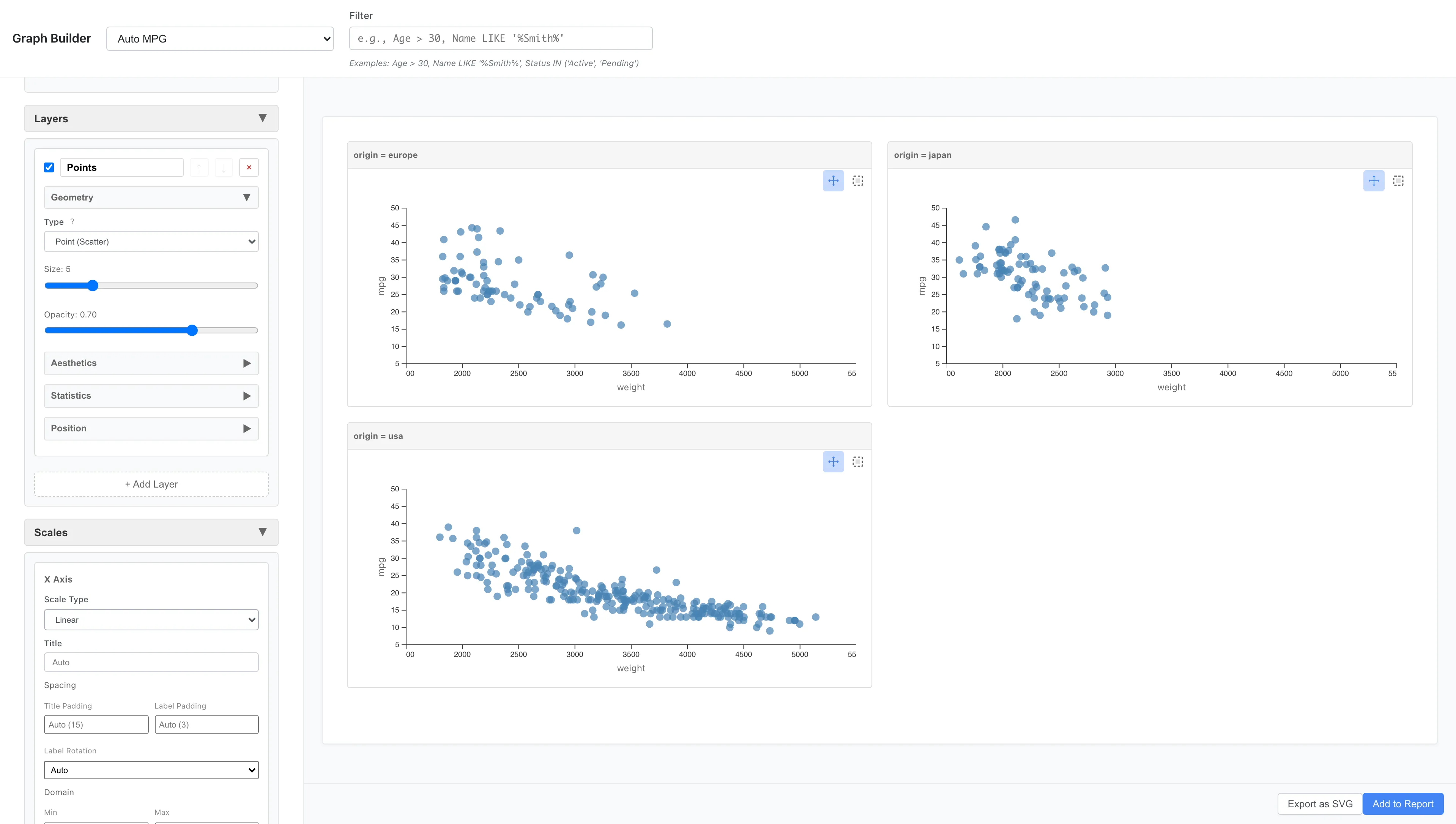
The data is split into one panel per origin (europe, japan, usa), and the panels are placed automatically in a grid as close to square as possible. Three panels become 2 columns × 2 rows. To arrange them in a single row, set Columns to 3.
Facet Wrap has options to control panel arrangement:
- Variable: Variable to use for division
- Columns: Number of panels per row (optional)
- Rows: Number of rows (optional)
- Scales: How axis scales are shared across panels. Fixed (default) uses the same axis range for all panels. Free X / Free Y / Free allows each panel to have its own axis range
If only Columns is specified, row count is calculated automatically. If only Rows is specified, column count is calculated automatically. If both are omitted, optimal arrangement is calculated based on panel count.
Facet Grid - Matrix Division
Facet Grid arranges panels along rows and columns using one or two variables.
Facets: Type = Facet Grid (Two Variables)
  Rows = origin
  Columns = cylinders
Graphs are arranged for each combination of cylinder count and origin.
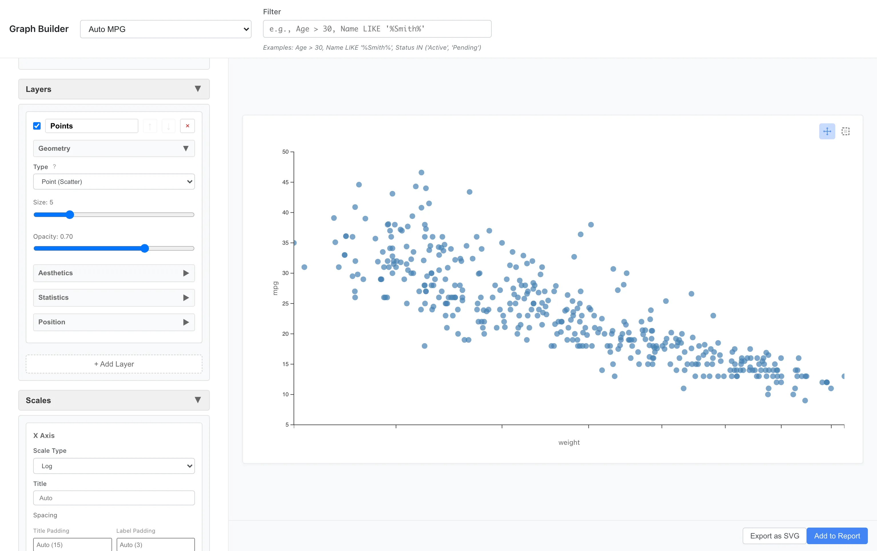
Scales - Scale Control
Logarithmic Scale
Logarithmic scale is effective when comparing data by ratios or when distributions are heavy-tailed. The logarithm is not defined for non-positive values (zero or below), so applying Log scale to a column that contains such values suppresses the plot and shows an error that reports the affected axis, column name, and the count of out-of-domain values. Square Root scale accepts 0 but is undefined for negative values and raises the same form of error when a column contains negatives. If you want to use Log or Square Root scale on such a column, shift the data into the positive range or exclude the affected rows first. A domain lower bound (min) you set under Scales must follow the same rule: greater than 0 for Log, non-negative for Square Root.
Scales: x = log
Color Scale
You can specify which colors to use with color scales.
Different palettes are available for continuous and categorical variables. See Custom Graph Reference for the full list.
Here we change the measurement scale of cylinders to Ordinal before plotting. You can change the scale by right-clicking a column in Data Table and choosing Edit Scale of Measurement.
Aesthetics: x = weight, y = mpg, color = cylinders
Scales: Palette = Viridis
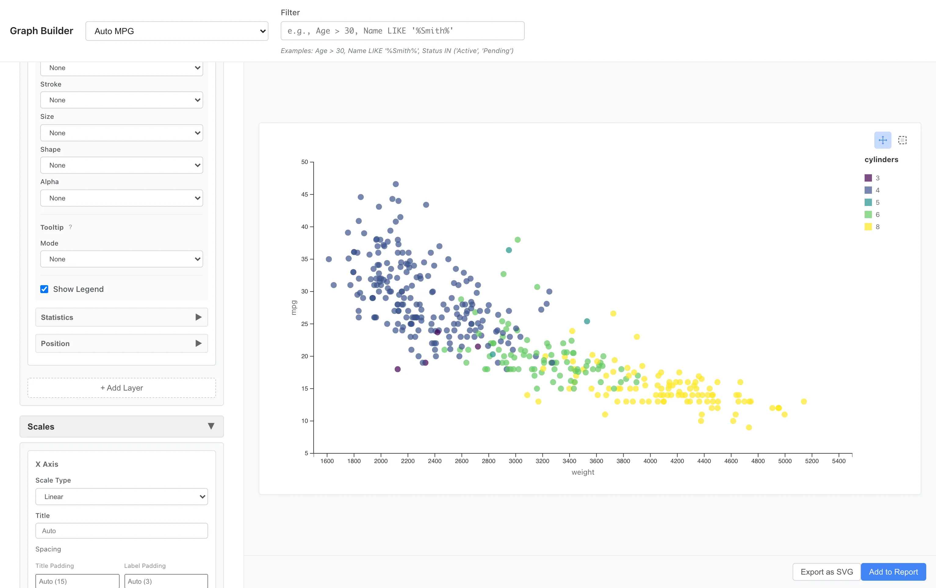
Viridis is a perceptually uniform palette that accommodates color vision diversity. When applied to an ordinal variable like cylinders, it samples the palette evenly across the full range for the number of categories, so lightness changes monotonically along the order. Plasma, Inferno, and Magma offer the same property.
Category order depends on the column type. Numeric columns are sorted in ascending numeric order, ordinal enum columns follow the enum definition order, and all other columns are sorted as strings in ascending order.
Geometry/Statistics Reference
See Custom Graph Reference for a complete list of Geometries and Statistics.
See also
- Custom Graph Reference - Complete list of Geometries and Statistics
- Creating Graphs - Basic graphs like Histogram, Scatter Plot, and Bar Chart
- Report - Combine graphs and tables into a report
Also available as a Markdown file.