Creating Graphs
Create graphs to visualize your data. This page explains basic graph types including histograms, scatter plots, bar charts, and time series plots.
How to Create Graphs
- Open Graph Builder tab: Select Analysis → Graph Builder... from the menu bar
- Select dataset: Choose the dataset to graph from the dropdown menu in the header
- Select graph type: Click the type of graph you want to display (Histogram, Scatter Plot, Bar Chart, etc.)
- Configure settings: Set axes and variables according to the selected graph type
- Histogram: Variable, number of bins, grouping
- Scatter plot: X-axis, Y-axis, color coding
- Bar chart: Category, value, aggregation method, sorting
- Adjust options: Set filter conditions and additional options as needed
Graphs are displayed in real-time in the preview area on the right, allowing you to explore optimal visualizations while changing settings.
Basic Graphs
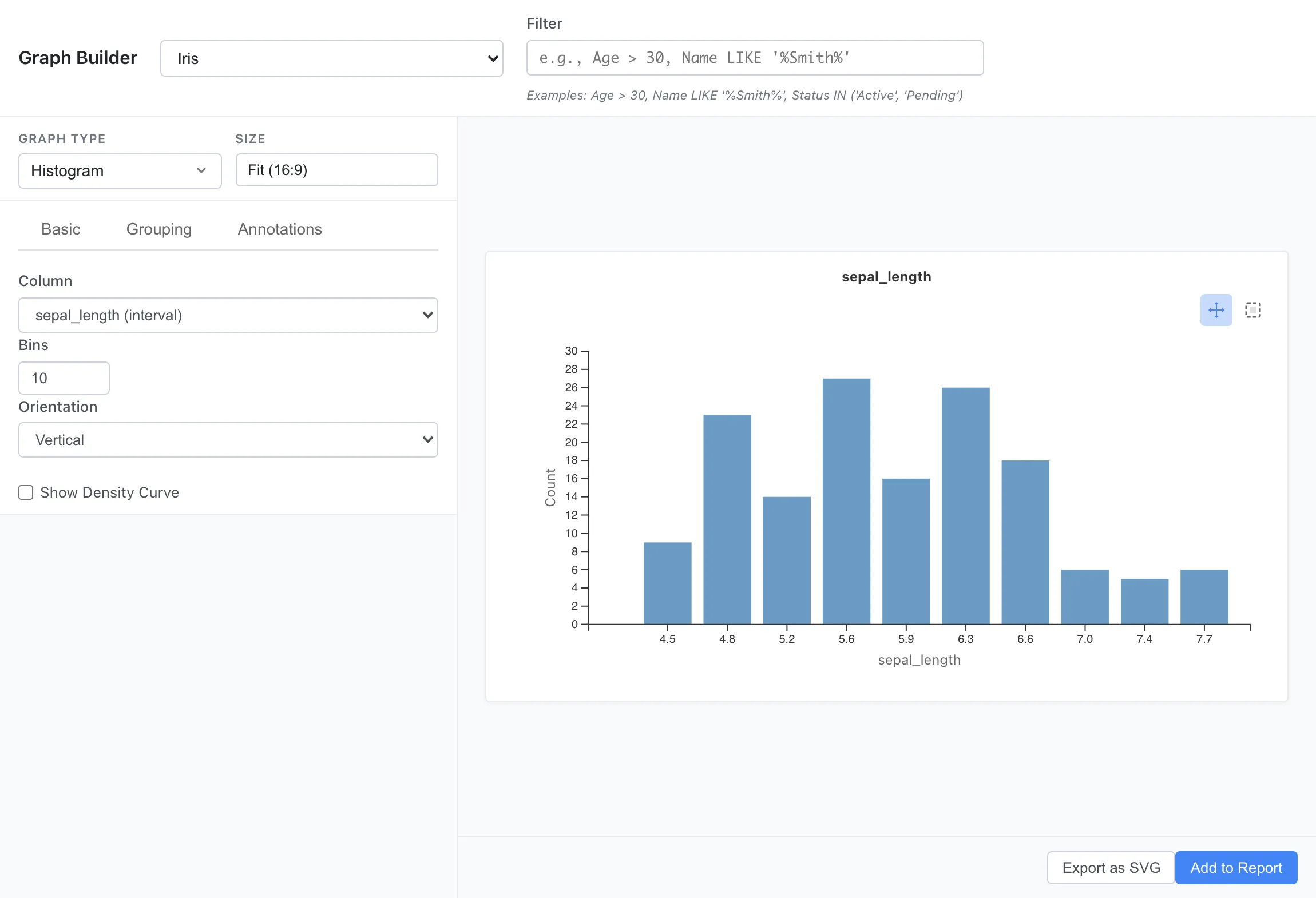
Histogram
Displays the distribution of a single numeric variable as a bar graph. Useful for understanding frequency distribution and shape of data, and identifying outliers.
Use cases:
- Check age distribution
- Examine test score distribution
- Understand sales amount distribution
Settings:
Basic tab:
- Column: Select the numeric column to graph
- Bins: Specify the number of bars (bins)
- Orientation: Vertical or horizontal bars
- Show Density Curve: Overlay a smooth curve computed by kernel density estimation. The density curve is drawn on a second axis (Density) on the right, so the count axis of the bars is unchanged. This shows the shape of the distribution independently of the bin boundaries
Grouping tab:
- Group By: Select a category column to display color-coded by group
Annotations tab:
- Show Mean: Display the mean as a solid line
- Show Median: Display the median as a dashed line
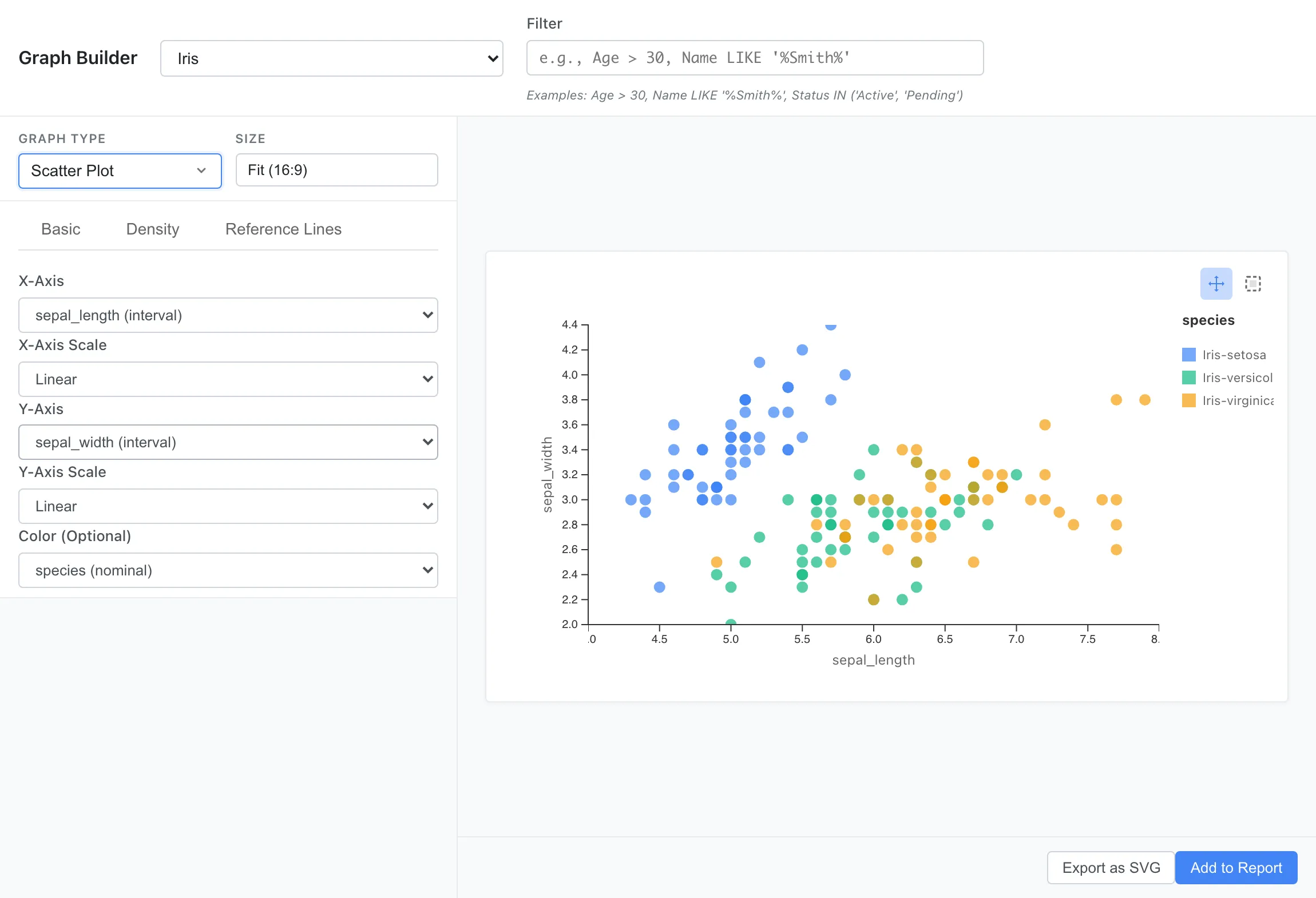
Scatter Plot
Visualizes the relationship between two numeric variables as points. Discover correlations, patterns, clusters, and outliers. Also supports contour display based on 2D kernel density estimation and grouping by categorical variables.
Use cases:
- Examine relationship between height and weight
- Check correlation between advertising spend and sales
- View relationship between scores in two exam subjects
Settings:
Basic tab:
- X-Axis: Numeric column for horizontal axis
- Y-Axis: Numeric column for vertical axis
- X-Axis Scale / Y-Axis Scale: Axis scale (Linear, Log, or Square Root)
- Color: Select a category column for color-coded grouping
Density tab:
- Display Mode: Select display mode
- Points only: Shows points only
- Density only: Shows only contours from 2D kernel density estimation
- Points + Density (Outliers Only): Shows contours and points. Despite the label, all points are currently displayed, producing the same result as Points + Density (All Points)
- Points + Density (All Points): Shows contours and all points
Reference Lines tab:
- Add Reference Line: Adds reference lines to mark specific values or thresholds
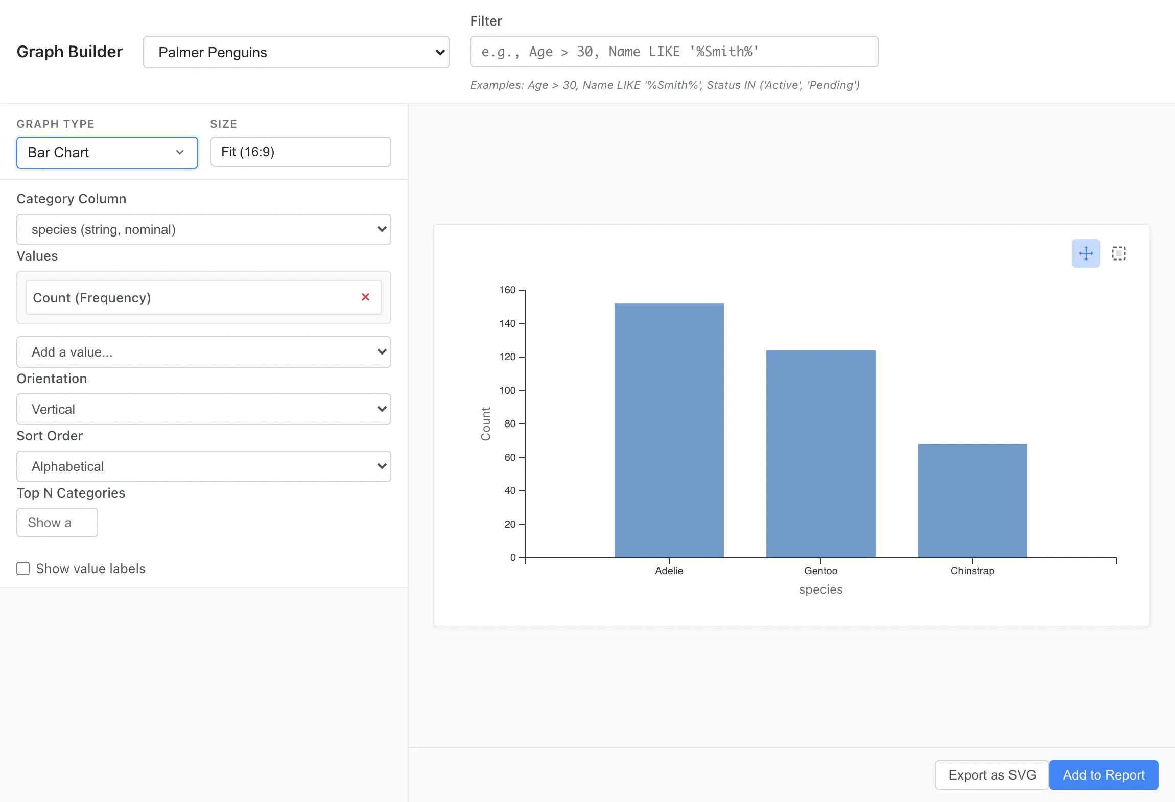
Bar Chart
Compares values by category using vertical or horizontal bars. Ideal for comparing categorical data, ranking displays, and showing aggregate statistics (count, sum, average, etc.).
Use cases:
- Compare sales by product category
- Display customer count by region
- Aggregate order count by month
Settings:
- Category Column: Column representing categories
- Values: Select a numeric column and an aggregation method (Sum, Average, Min, or Max). Choose Count (Frequency) instead to count rows per category
- Orientation: Vertical or horizontal bars
- Sort Order: Sort order (alphabetical, value descending/ascending)
- Top N Categories: Display only the top N categories
- Show value labels: Display values on top of bars
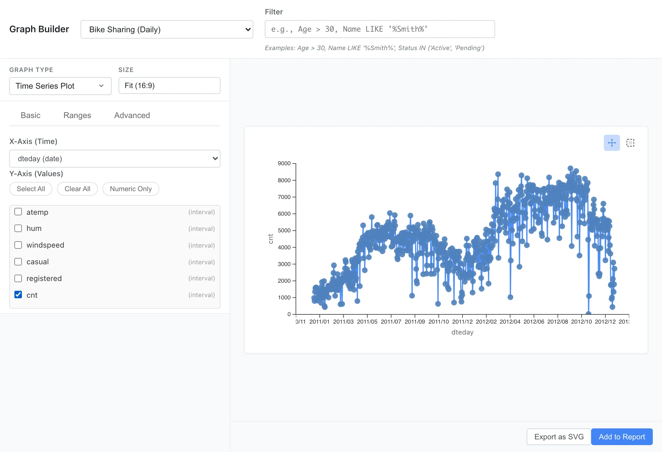
Time Series Plot
Displays data changes over time as a line chart. Identify trends, seasonality, and patterns. Multiple time series are displayed together, distinguished by color.
Use cases:
- Check daily sales trends
- Track monthly visitor changes
- Observe annual temperature variations
Settings:
Basic tab:
- X-Axis (Time): Column for the horizontal axis. Date and datetime columns can be selected, as well as numeric columns such as elapsed time or sequence numbers
- Y-Axis (Values): Numeric columns to display (multiple selection supported)
Ranges tab:
- Custom Range Bands: Add bands to highlight specific periods or ranges
Advanced tab:
- Chart Title: Set the graph title
Other Graphs
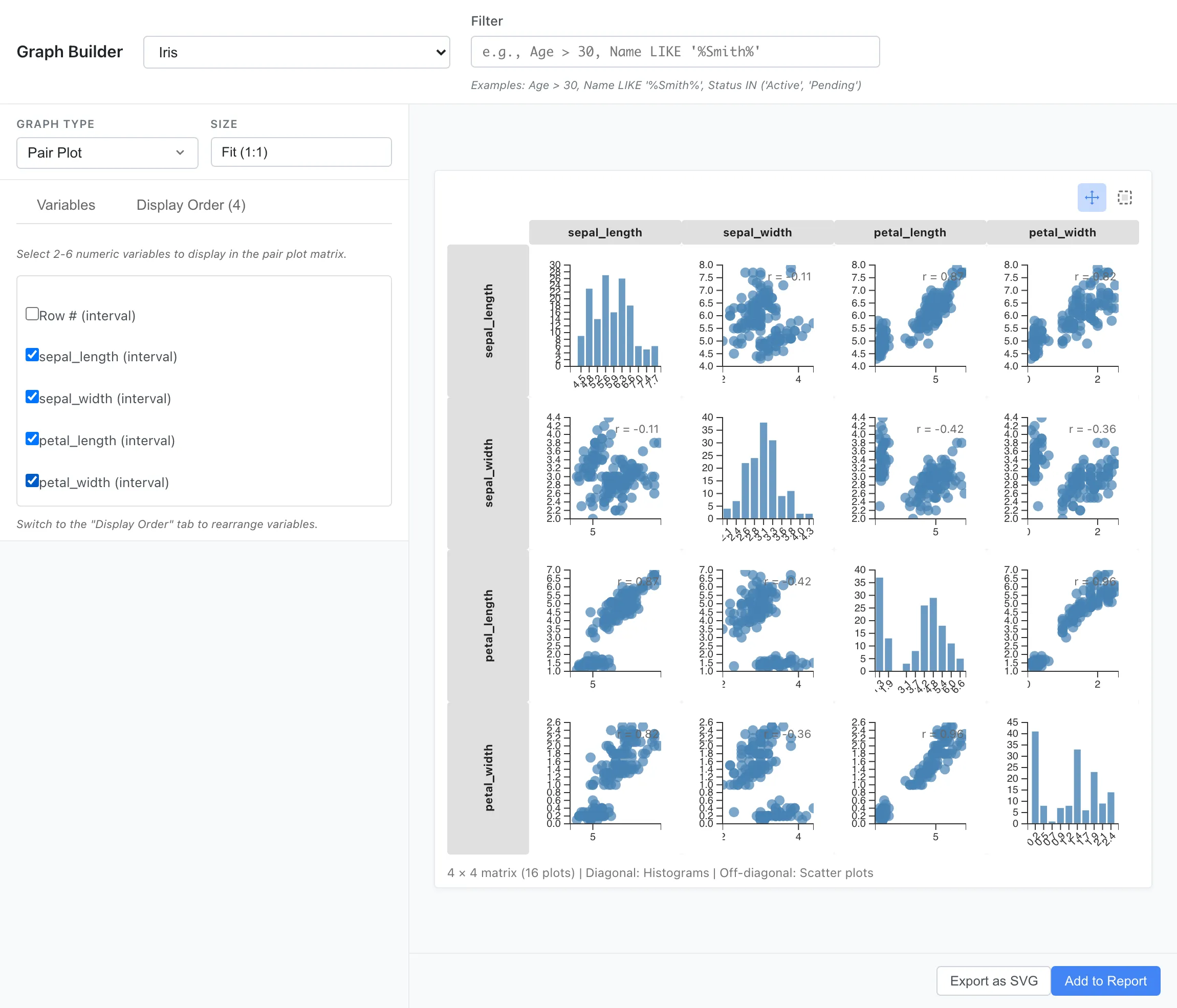
Pair Plot
Displays pairwise relationships between multiple numeric variables as a scatter plot matrix. The diagonal shows histograms, and off-diagonal cells show scatter plots with correlation coefficients.
Use cases:
- Check correlations between multiple measurements at once
- Understand the overall structure of a dataset
Settings:
- Variables: Select numeric columns via checkboxes. Columns with an interval/ratio scale are eligible, and 2 to 10 variables can be selected. A warning about increased rendering time is shown when more than 6 variables are selected
- Display Order: Change the display order of selected variables
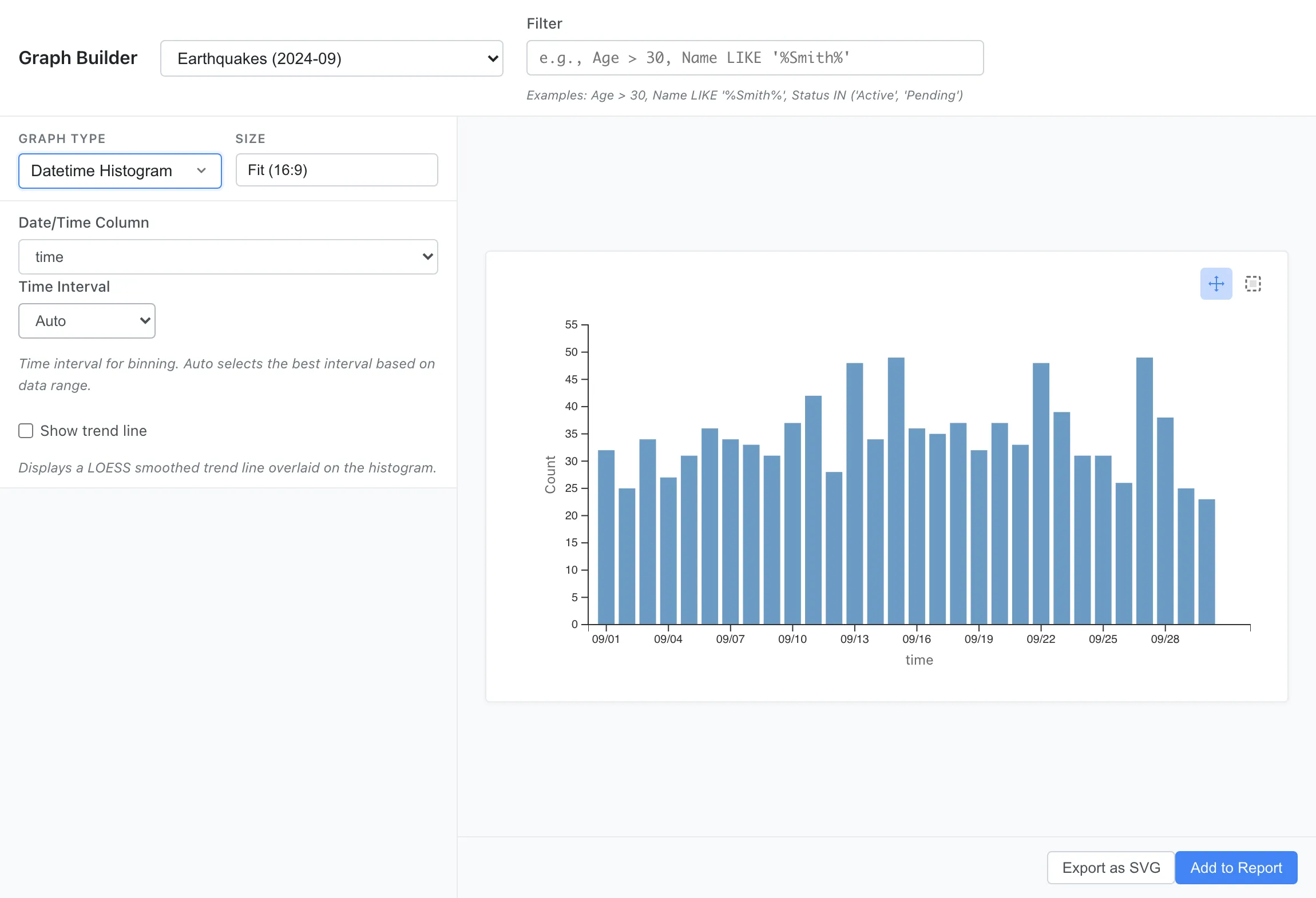
Datetime Histogram
Visualizes the distribution of datetime data as a histogram on a time axis. Aggregates event frequency by time interval to identify temporal patterns.
Use cases:
- Check log event frequency by time period
- Visualize concentration of access times
- Analyze temporal distribution of orders and transactions
Settings:
- Date/Time Column: Column representing datetime or date
- Time Interval: Aggregation time interval (Auto, 1 minute to 1 year)
- Show trend line: Display a trend line using LOESS (locally weighted regression). The span is fixed at 0.75 (75% of all data points are used as the neighborhood)
Custom Graph
Creates flexible visualizations based on Grammar of Graphics principles. Build layered plots by combining geometric elements, statistical transformations, and aesthetic mappings.
See the Custom Graph Guide for details.
Graph Operations
Interactive Selection
All graphs support data point selection. Selection methods vary by graph type:
Click selection: Click data points, bars, or bins to select. Ctrl/Cmd+click to add to the selection.
Rectangle selection: Switch to Select mode using the mode toggle buttons in the top-right corner of the graph, then drag to select.
- Pan mode: Drag graph to move the display range (default)
- Select mode: Drag mouse to select a range
Selected rows are highlighted in other tabs such as Data Table, Statistics, and Selected Rows. See Row Selection for details on cross-tab synchronization.
Export
Click the Export as SVG button below the preview to download the graph as an SVG file. SVG is a vector format that maintains quality at any scale.
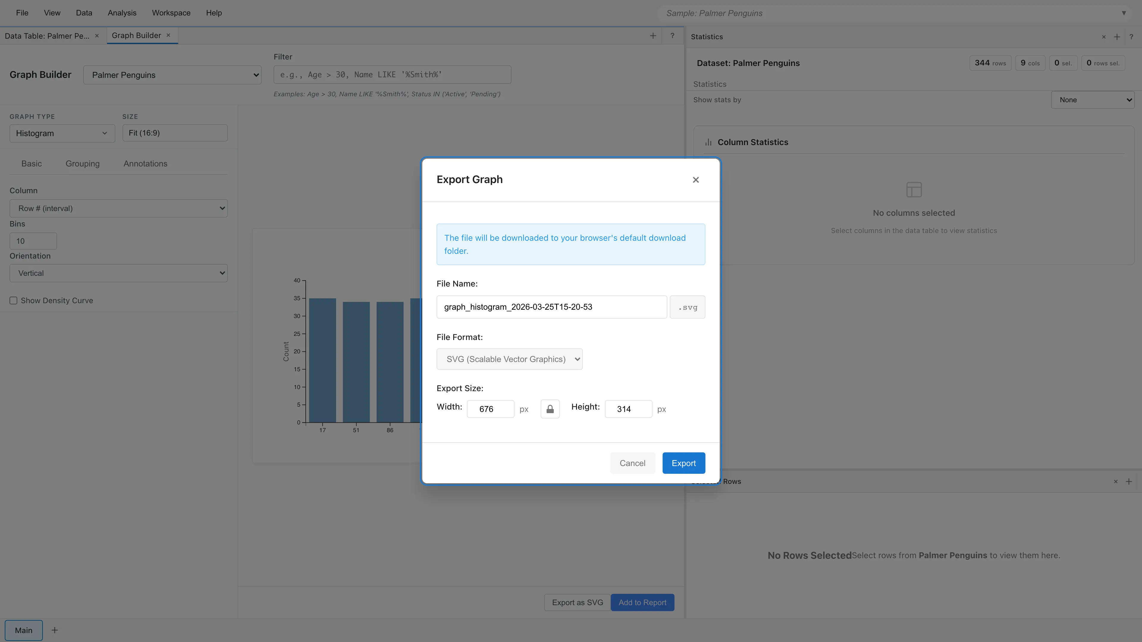
File Name - Specify the output file name. The .svg extension is added automatically.
Export Size - Specify the width and height of the output SVG in pixels. Values range from 100 to 10000. The initial values match the current preview size.
Aspect ratio lock - Locks the aspect ratio between width and height. Changing one value automatically adjusts the other.
Graphs added to a report can also be exported from the report element menu. See Reports for details.
Saving Graphs
Graph settings created in Graph Builder are automatically saved to the project as tab state. Graph settings are preserved when you close and reopen the project.
Changing Settings
Graph settings (column selection, filters, display options, etc.) can be changed at any time. Graphs update in real-time when settings are changed.
Next steps
- Custom Graph - Flexible visualization with Grammar of Graphics
- Report - Compile graphs and tables into reports
See also
- Basic Statistics - Scatter plot matrices and correlation matrices for multivariate comparison
- Data Preparation and Import - Measurement scale settings that affect graph creation
Also available as a Markdown file.