Tutorial: Comparing Groups with ANOVA and Linear Regression
This tutorial walks through finding patterns with graphs, quantifying them with ANOVA and linear regression, and organizing the results in the Report tab, using inspection data from a manufacturing plant.
Consider a plant where three lines — A, B, and C — produce the same part, and a report has come in that Line B's dimension errors are larger. Environmental conditions such as temperature and humidity also change from day to day, so the assumed situation is that you want to separate the effect of the line from the influence of the environment.
Load the Data
Click Production Line in the Sample Data section of the launcher screen to load a dataset with 300 rows and 7 columns.
| Column | Description |
|---|---|
line | Production line (A / B / C) |
shift | Shift (Day / Night) |
operator | Operator ID (Op1 -- Op5) |
temperature | Ambient temperature (°C) |
humidity | Humidity (%) |
cycle_time | Cycle time (seconds) |
dimension_error | Magnitude of deviation from the target dimension (mm, non-negative) |
dimension_error is the response variable. It is non-negative; smaller values mean the part is closer to the target dimension.
Explore with Graphs
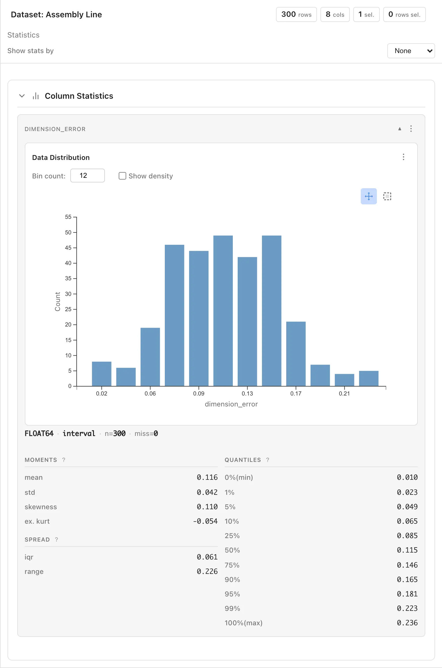
Click the dimension_error column in the Data Table tab. The Statistics tab shows a histogram and summary statistics. The overall mean is approximately 0.116 mm and the standard deviation is approximately 0.042 mm.
Select line from the Show stats by dropdown to switch to per-line statistics. Line B's mean is higher than A's or C's.
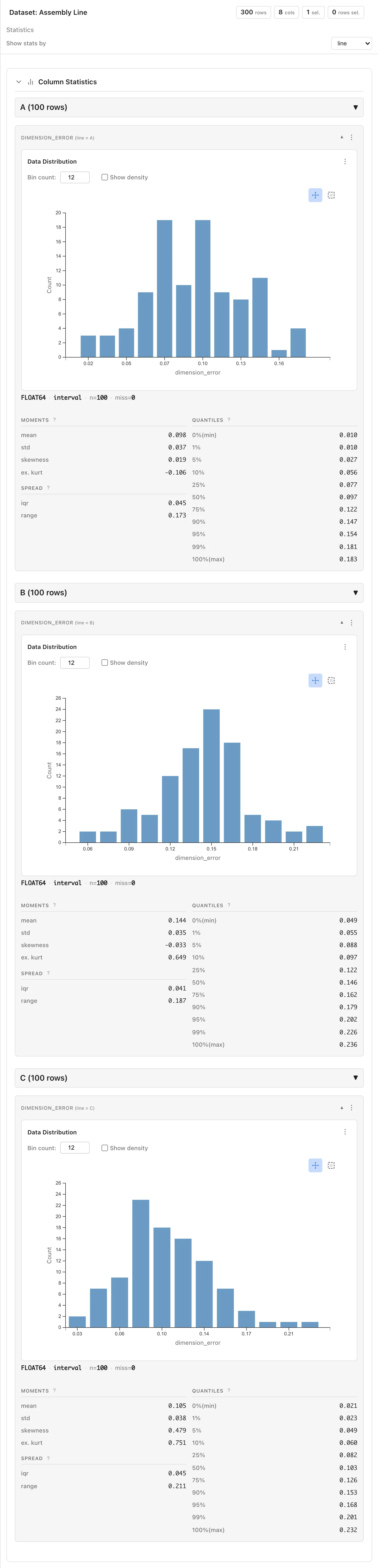
The Statistics tab showed the per-line distributions as overlays. Arranging the lines on a shared axis with Graph Builder's Faceted display makes the relative positions of the distributions visible at a glance. Open Analysis > Graph Builder..., create a Histogram, set Column to dimension_error, set Group By to line, choose Faceted, and set Columns to 1.
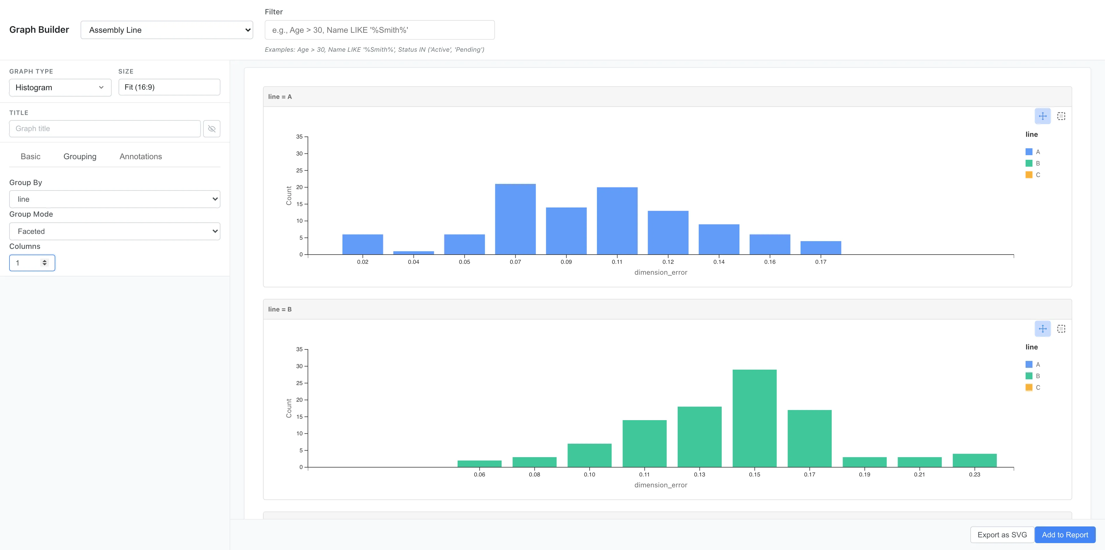
Scroll down to see the histograms for lines A, B, and C stacked vertically.
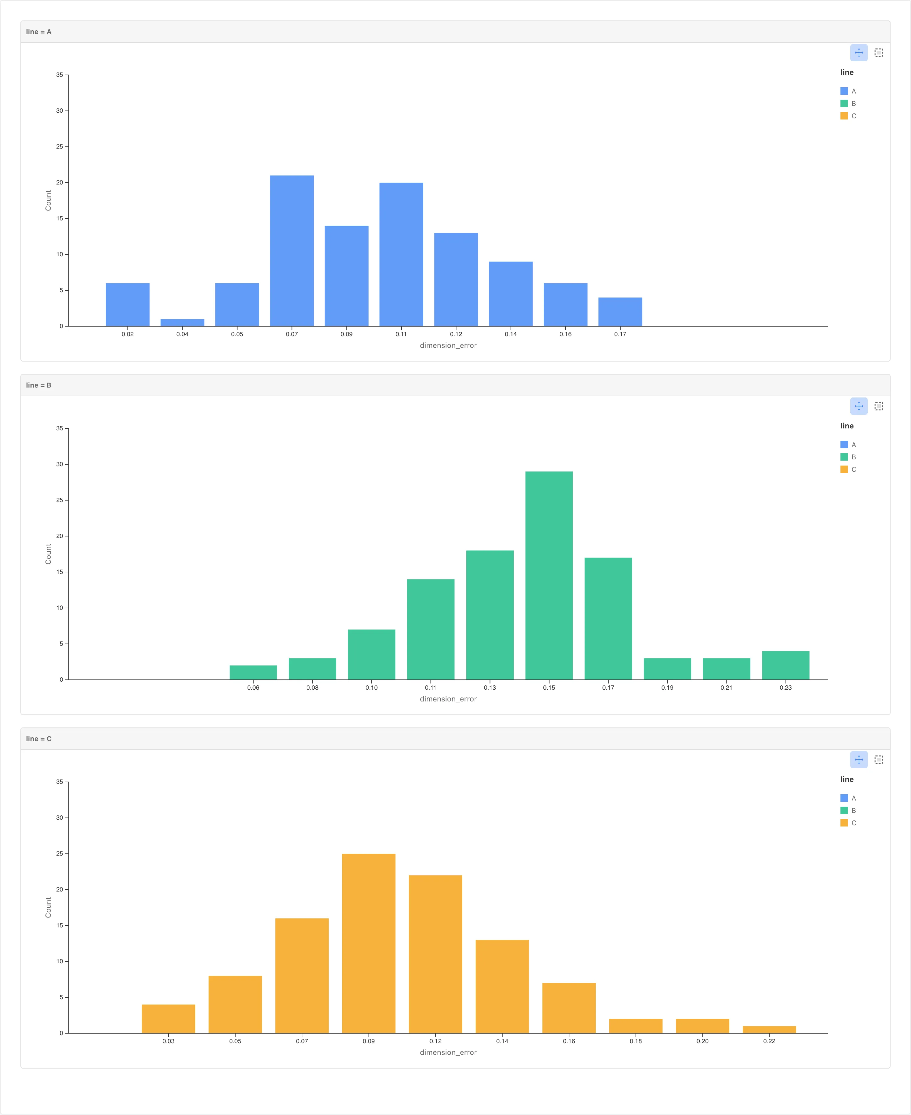
Line B's histogram is shifted to the right. A and C sit in similar positions.
Next, explore the relationship with environmental conditions. Create a Scatter Plot in Graph Builder with X set to temperature, Y to dimension_error, and Color to line.
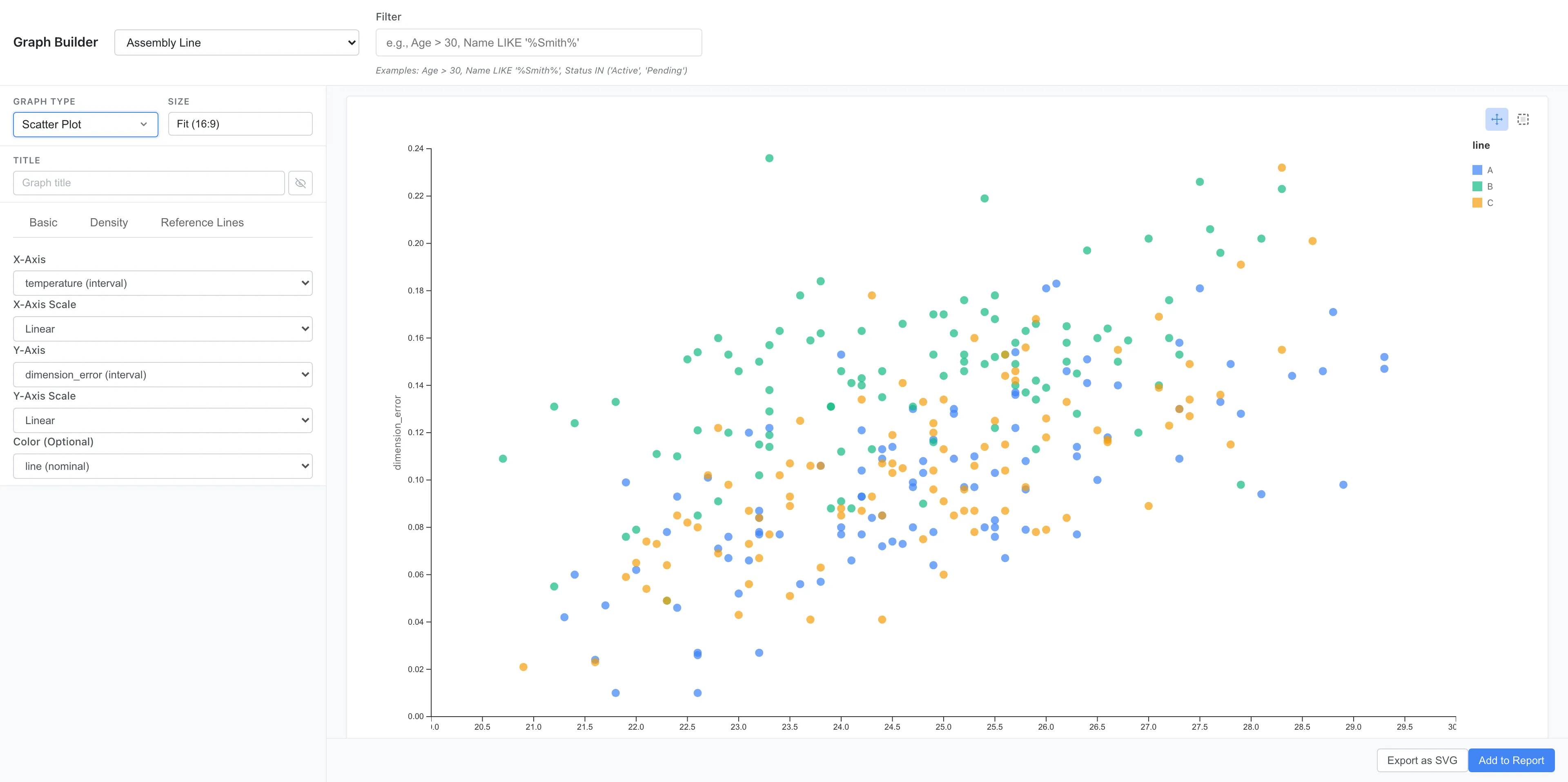
Dimension errors tend to be larger at higher temperatures. Within the same temperature range, Line B's points sit higher than the others.
A question arises here: is Line B's error larger simply because Line B runs hotter? In the scatter plot, points of every color spread across the same range of temperatures, and no line is concentrated in the high-temperature region.
The exploration so far surfaced two patterns: Line B has larger errors, and temperature appears positively related to error. The following sections quantify these two patterns with ANOVA and regression.
Estimate Line Differences with ANOVA
The graphs suggest Line B's dimension error is larger, but they do not show how many millimeters larger it is, or how precise that estimate is. ANOVA estimates the mean differences between lines with confidence intervals.
The data also contains shift and operator, but we focus on line differences first. Open Analysis > ANOVA..., choose One-Way, set line as the Factor and dimension_error as the Response, and run the analysis.
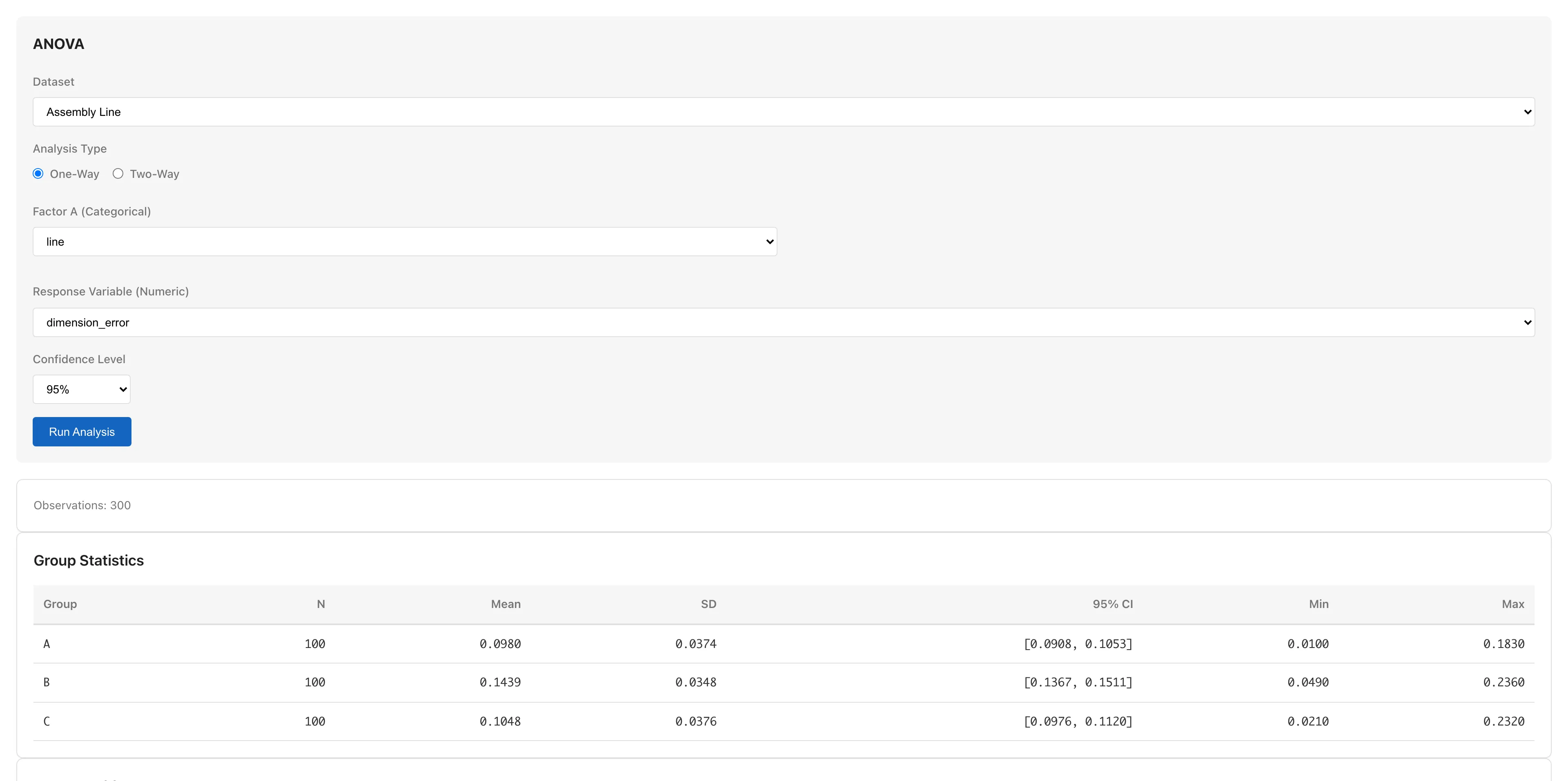
The table shows each group's mean with a 95% confidence interval. Line B's mean is approximately 0.144 mm, higher than A (approximately 0.098 mm) and C (approximately 0.105 mm).
Next, estimate the differences between lines themselves. Subtracting the means gives the size of each difference, but how precise that estimate is needs to be read from a confidence interval. The Pairwise Mean Differences (Tukey HSD) section in the results area shows the mean difference for every pair with simultaneous confidence intervals1.
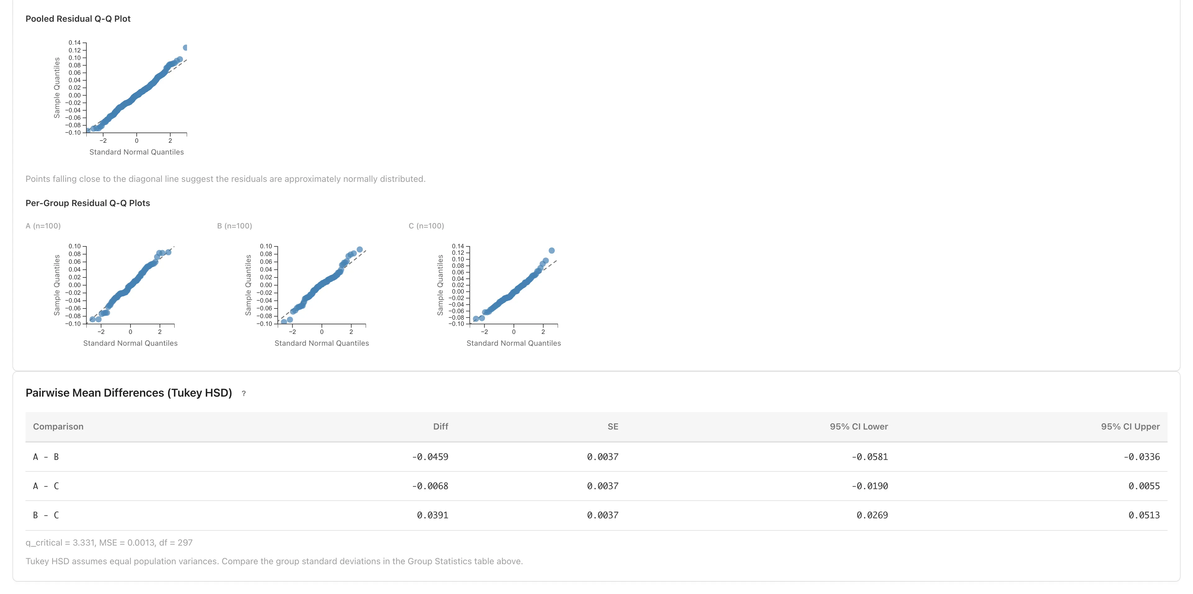
| Pair | Difference (mm) | Direction |
|---|---|---|
| A -- B | approx. −0.046 | B is larger |
| A -- C | approx. −0.007 | nearly equal |
| B -- C | approx. +0.039 | B is larger |
Each difference is computed as "left line − right line" in the pair heading; a negative value means the right line is larger.
The confidence intervals for A -- B and B -- C do not include zero: the differences consistent with the data all share one sign. The A -- C interval straddles zero, so even the direction of that difference is not settled.
Line differences are not the whole story, though. In the ANOVA Table, η² is approximately 0.24, meaning that in this dataset about 24% of the total variance in dimension error is explained by differences between lines2. The remaining 76% or so is within-line variation — differences in environmental conditions, measurement variability, and other factors.
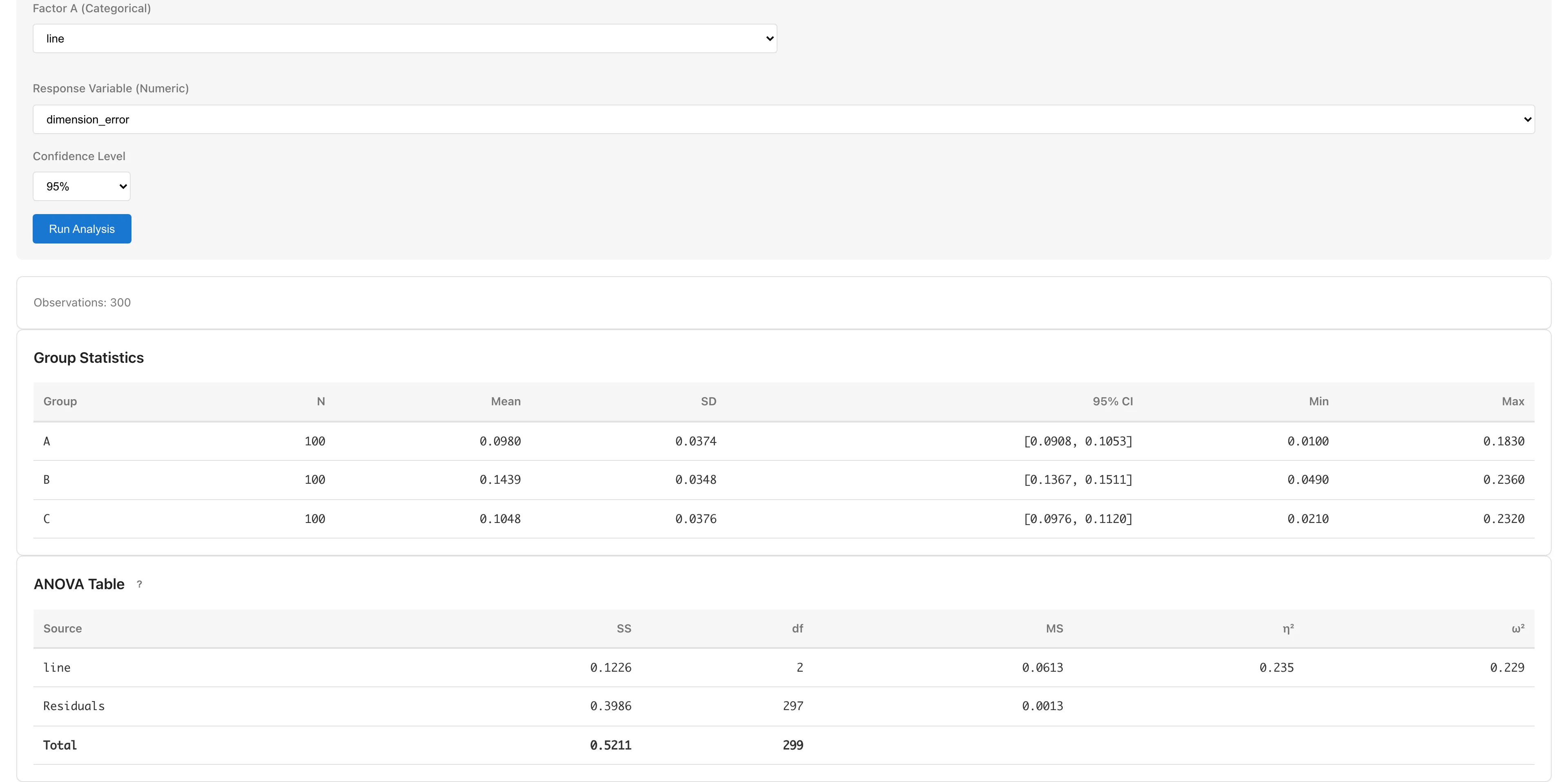
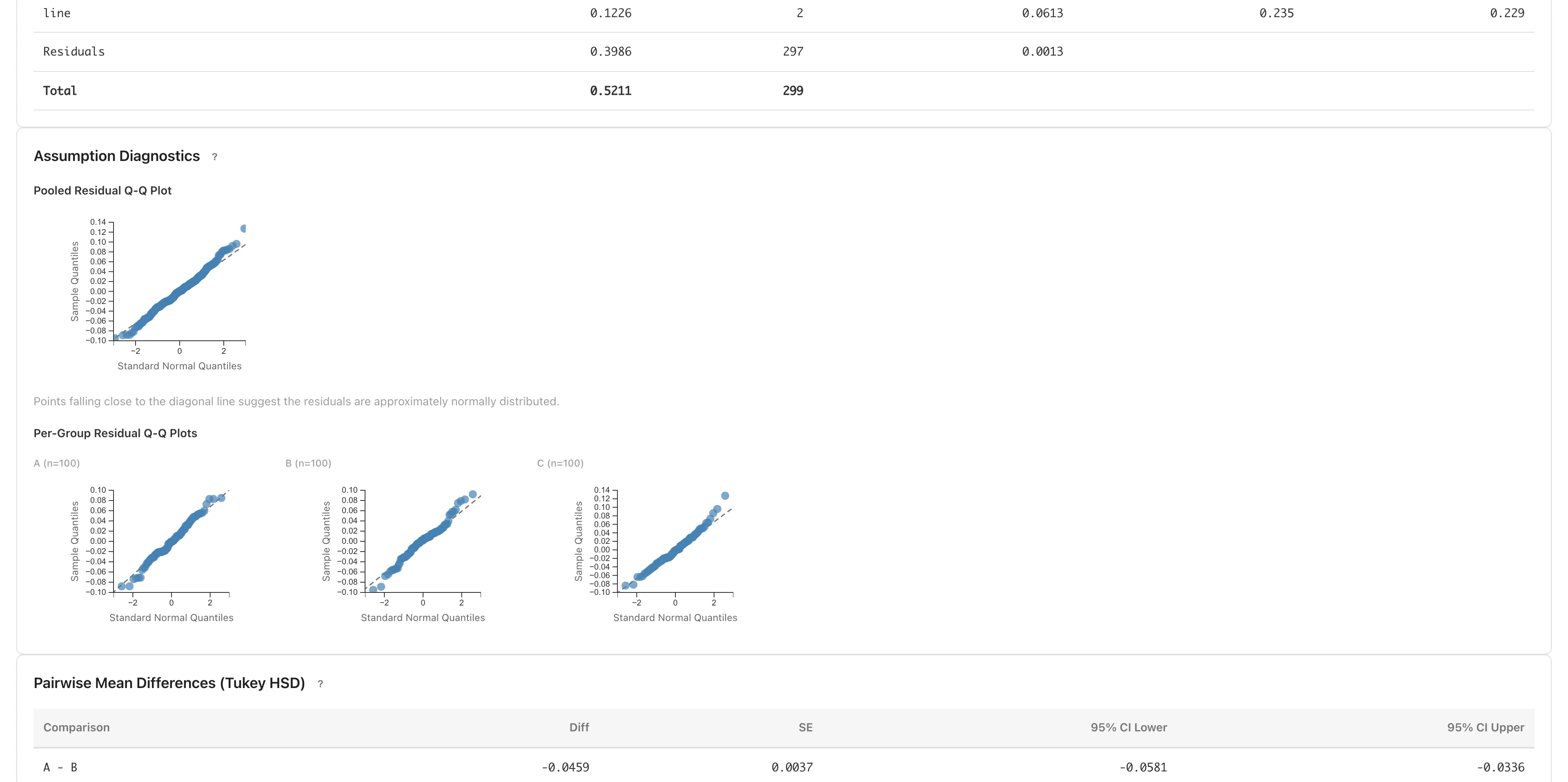
The confidence intervals read so far rest on the ANOVA assumptions, so check for strong departures in the Assumption Diagnostics section3.
Normality is checked with Q-Q plots. Because ANOVA assumes normality within each group, the plots to read are the per-group Q-Q plots. If each line's residuals roughly follow the diagonal, there is no obvious departure from normality.
Equal variance is checked by comparing the per-group SDs. The per-line SDs are similar at 0.035 -- 0.038, a max-to-min ratio of about 1.1. There is no large departure.
Evaluate Line Effects and Environmental Factors with Regression
ANOVA looked only at line differences; the contribution of the environmental variables is still unknown. Linear regression puts the line effects and the environmental factors into a single model and estimates them together.
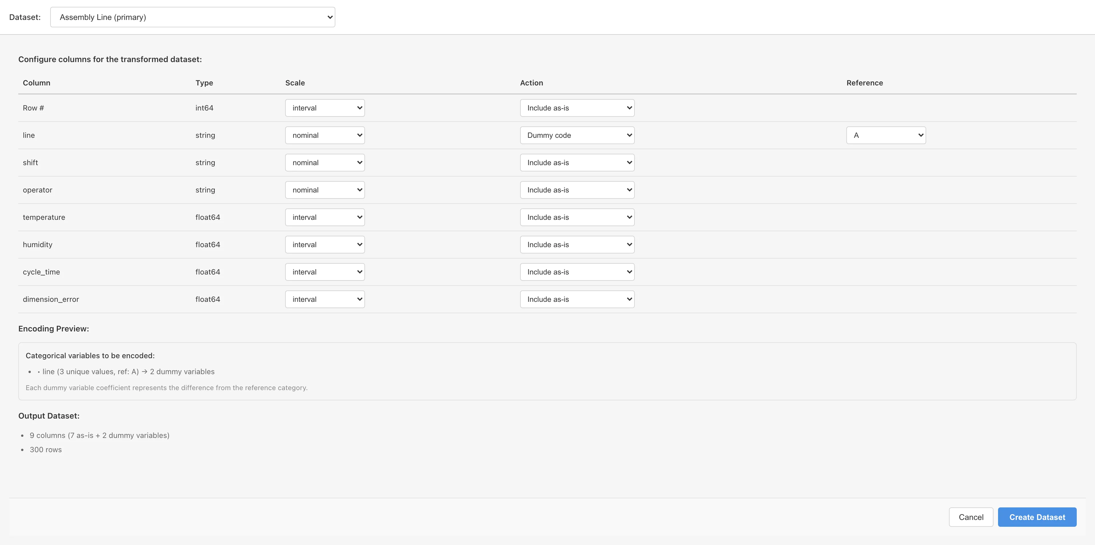
OLS predictors must be numeric, so convert line (A/B/C) into 0/1 columns. Open Data > Dummy Coding... and set the Action for line to Dummy code. Reference defaults to A, the first value in the category order, and two columns are generated with A as the reference: line_B (is it B?) and line_C (is it C?)4.
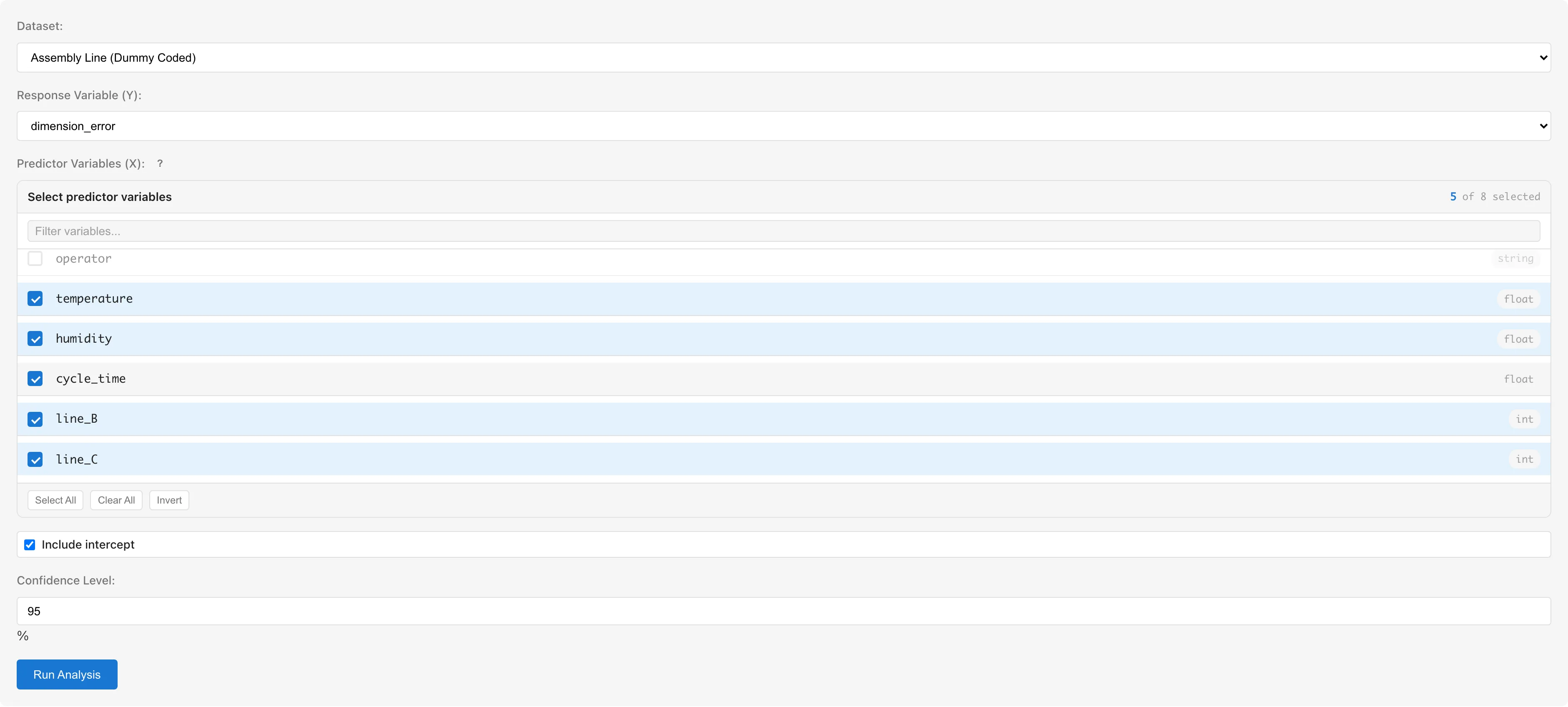
On the converted dataset, open Analysis > Linear Regression (OLS)... and set dimension_error as the Response and line_B, line_C, temperature, humidity, and cycle_time as Predictors.
Click Run Analysis.

R² is approximately 0.71: the line effects and environmental variables together explain about 71% of the variance in dimension_error.
Interpret the Coefficients
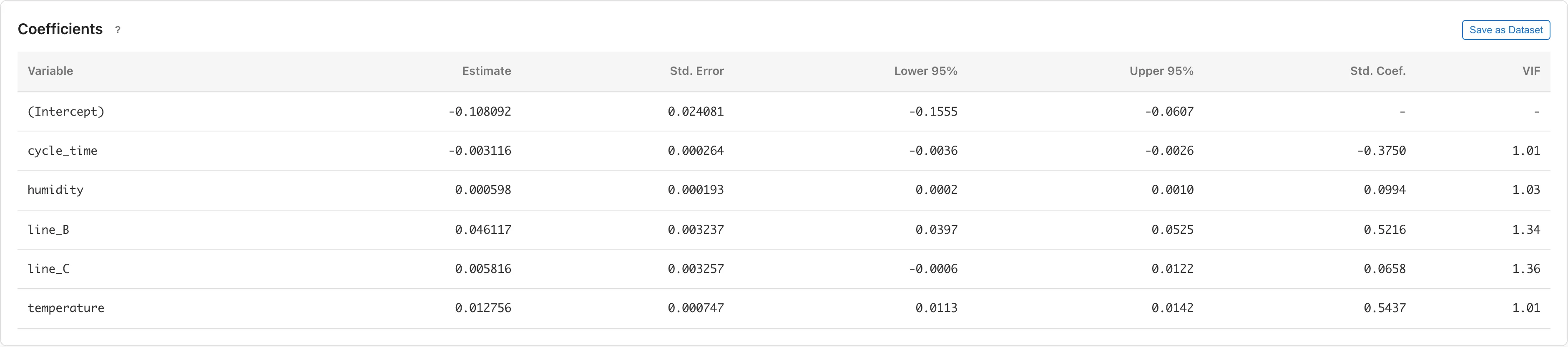
The line_B coefficient is approximately +0.046 mm. Comparing observations with the same temperature, humidity, and cycle time, Line B's dimension error is estimated to be on average 0.046 mm larger than Line A's. Comparing while holding the other variables constant this way is called "controlling" for them in regression5. This value is nearly the same as the Tukey HSD A -- B difference: Line B's effect remains after controlling for the environmental variables, so the size of its error is not explained by a skew in environmental conditions. The line_C coefficient is approximately +0.006 mm with a confidence interval straddling zero, showing no clear difference from A.
The temperature coefficient is approximately +0.013 mm/°C. With the other variables equal, the model's predicted dimension error increases by 0.013 mm for each additional 1°C.
The cycle_time coefficient is approximately −0.003 mm/s; observations with longer cycle times tend to have smaller errors.
The humidity coefficient is small at 0.001, contributing little6.
Check the Diagnostic Plots
These coefficients and confidence intervals assume normality, equal variance, and linearity of the residuals. Name the model, click Save Model, then View Diagnostics to inspect the diagnostic plots.
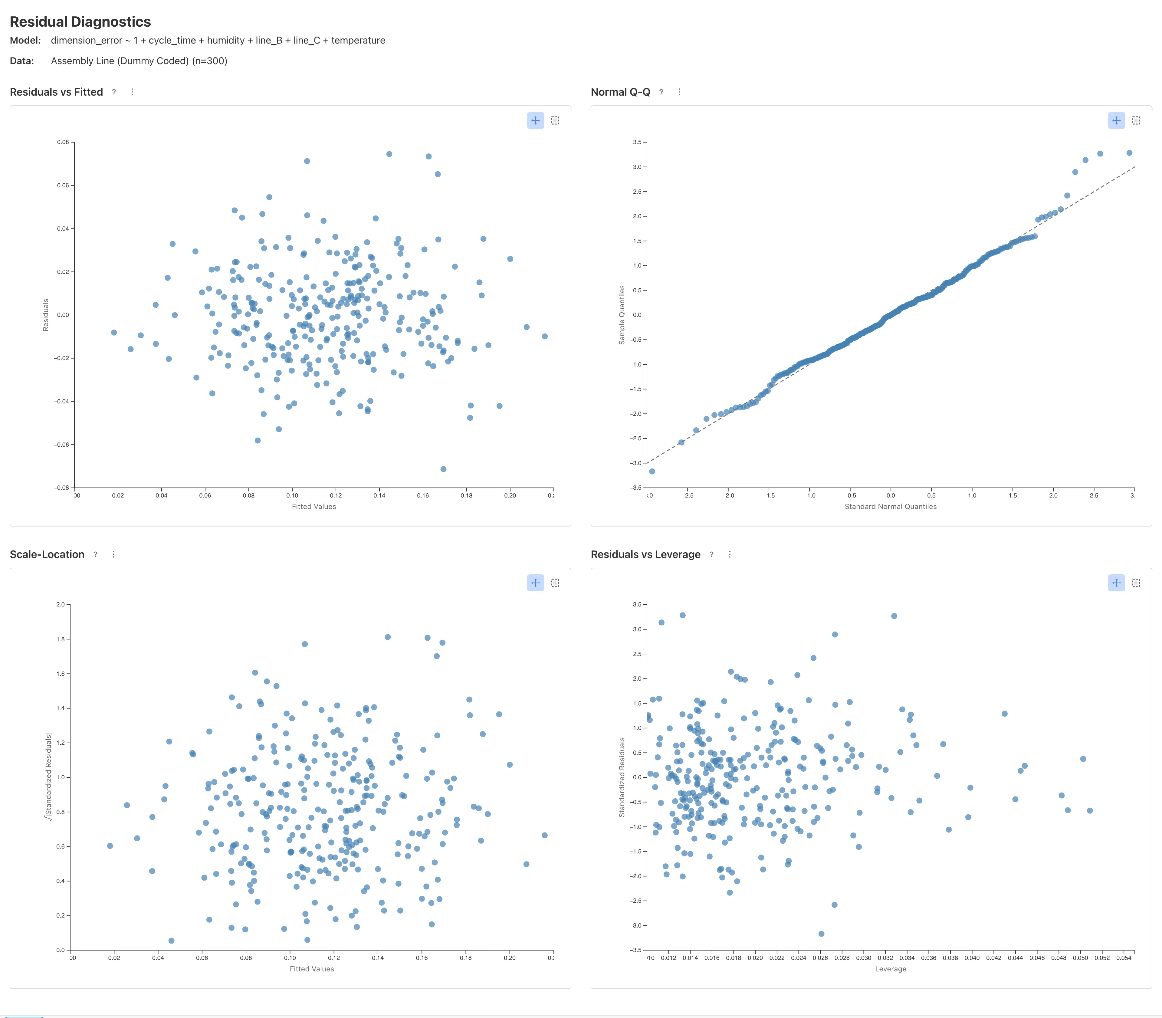
None of the four diagnostic plots shows a pattern that would indicate a violated assumption. In Residuals vs Fitted the residuals scatter around zero regardless of the fitted value, and in Scale-Location the size of the residuals shows no systematic trend. In Normal Q-Q the standardized residuals roughly follow the diagonal. In Residuals vs Leverage, every observation's influence is so small that the Cook's Distance contours marking influential observations do not even enter the plotting range7.
Collect the Results in the Report Tab
Now organize the results into a single report. Each result is added with the Add to Report button, found in the following places:
- Graph Builder graphs: below the preview
- Each ANOVA table: in its section heading
- Linear regression: in the results area for the model saved in the previous section
Clicking the button opens a menu or dialog where you pick an existing report as the destination or create a new one.
The added elements appear in the Report tab. Selecting Edit Content from the ⋮ menu in the report header opens the Markdown editor, where you can write headings and explanatory text between the elements and rearrange their order8.
Assembled into a report, the results of this analysis look like this.
View Live Demo
Click to launch the MIDAS application
Summary
For the initial report that Line B's dimension errors are larger, here is what the analysis showed.
- Line B's dimension error is on average 0.046 mm larger than Line A's and remains after controlling for the environmental variables (the regression line_B coefficient and Tukey HSD nearly agree). There is no clear difference between A and C
- Line differences account for only about 24% of the total variance; the rest comes from factors other than the line, with temperature showing a positive association (approximately 0.013 mm per 1°C) and cycle time a negative one
Related Pages
- ANOVA -- ANOVA tab details, two-way ANOVA, sum of squares types
- Linear Regression -- coefficients table, diagnostic plots, prediction intervals
- The Graph Builder Tab -- graph types available in Graph Builder
- Report -- Report tab operations
Footnotes
-
Simultaneous intervals are made wider than usual so that, taken together across all pairs, they hold the stated confidence level. For the method, see Tukey HSD. ↩
-
The table also shows ω², which corrects the upward bias that η² has as an estimator of the population proportion of variance. In this dataset the two are nearly the same. See the ANOVA table for details. ↩
-
For the assumptions in detail, see ANOVA assumptions. ↩
-
For why no column is made for A and how to choose the reference, see Dummy Coding. ↩
-
See Interpreting coefficients for details. ↩
-
The coefficients table also has columns for the standardized coefficient (Std. Coef.) and the variance inflation factor (VIF); see Coefficients for how to read them. ↩
-
For how to read each plot and what to do when problems appear, see the diagnostic plots in Linear Regression. ↩
Also available as a Markdown file.